Site visitors are having trouble finding what they need when navigating the NSW Government homepage. With an overly-complex navigation menu and not enough content on the homepage, users are forced to click through multiple unorganised links to find what they need.
A new list feature on the homepage allows site visitors to quickly find what they need without thinking too much and getting frustrated.
THE PROBLEM
The task was a top-down initiative, but I took ownership of the end-to-end design and research process. I oversaw the ideation of different solutions, and subsequent testing to validate the designs.
The Senior Leadership Team found that site visitors were having trouble finding what they needed easily once they landed on NSW Government's homepage. In June 2023, there were 174,111 interactions within the megamenu (less than 1% of total interactions on the site). There is also a limit of 14 links that can be shown at once in the megamenu, so not all 20 links can be viewed all at once. Hence, site visitors are not exploring the suggested topics and are finding it more difficult to find what they need, especially as the topics are not clearly categorised in the megamenu.
nsw.gov.au megamenu
I was provided with a list of 20 topics that were to be incorporated onto the homepage, in a location where site visitors could easily access. I found that this was an opportunity to understand our customers' information-searching behaviours better, and look into how people mentally categorise these topics.
Problem statement
How can we format 20 topic links in a way that the user can easily and quickly interact with?
How can we format 20 topic links in a way that the user can easily and quickly interact with?
DESIGN IDEATION
In the ideation stage, I brainstormed and mocked up different ideas on how to display the 20 topic links. It is also important to note that to adhere to NSW Government brand guidelines, I used existing components from the design system while ideating.
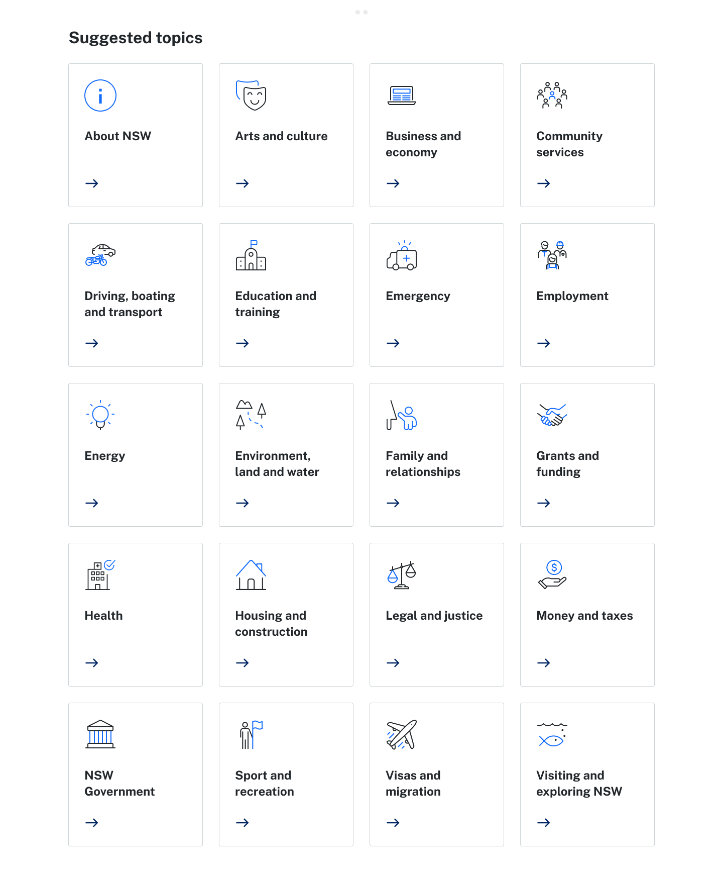
Cards were not used as the responsive design would have lengthened the feature on mobile devices..
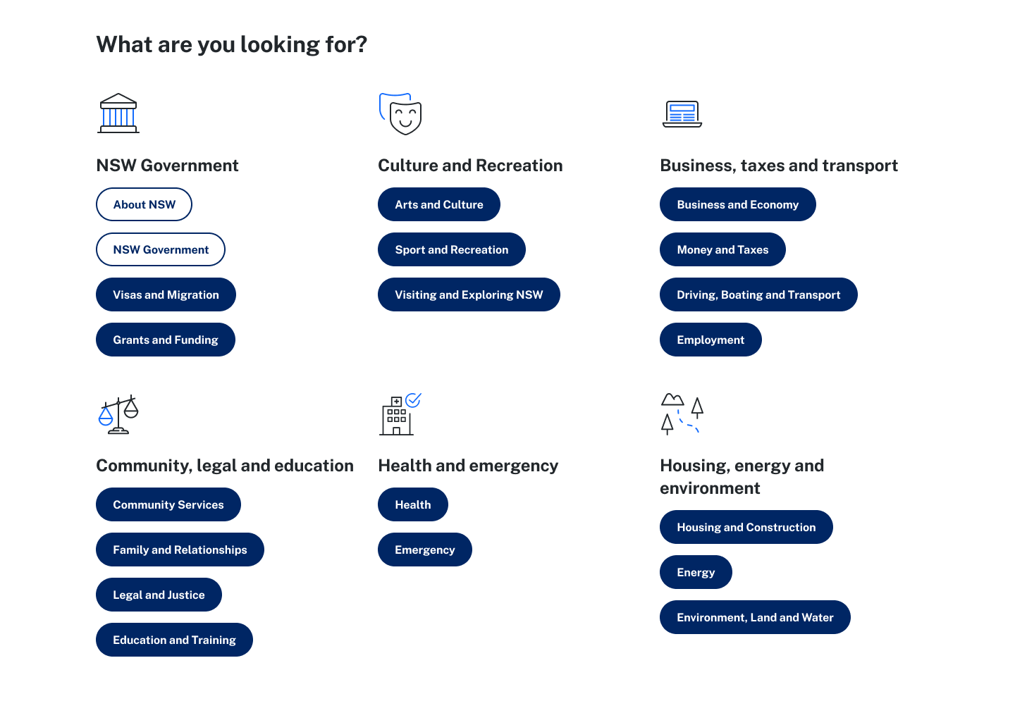
Pill buttons were already a component in other areas of the website and may confuse some users.
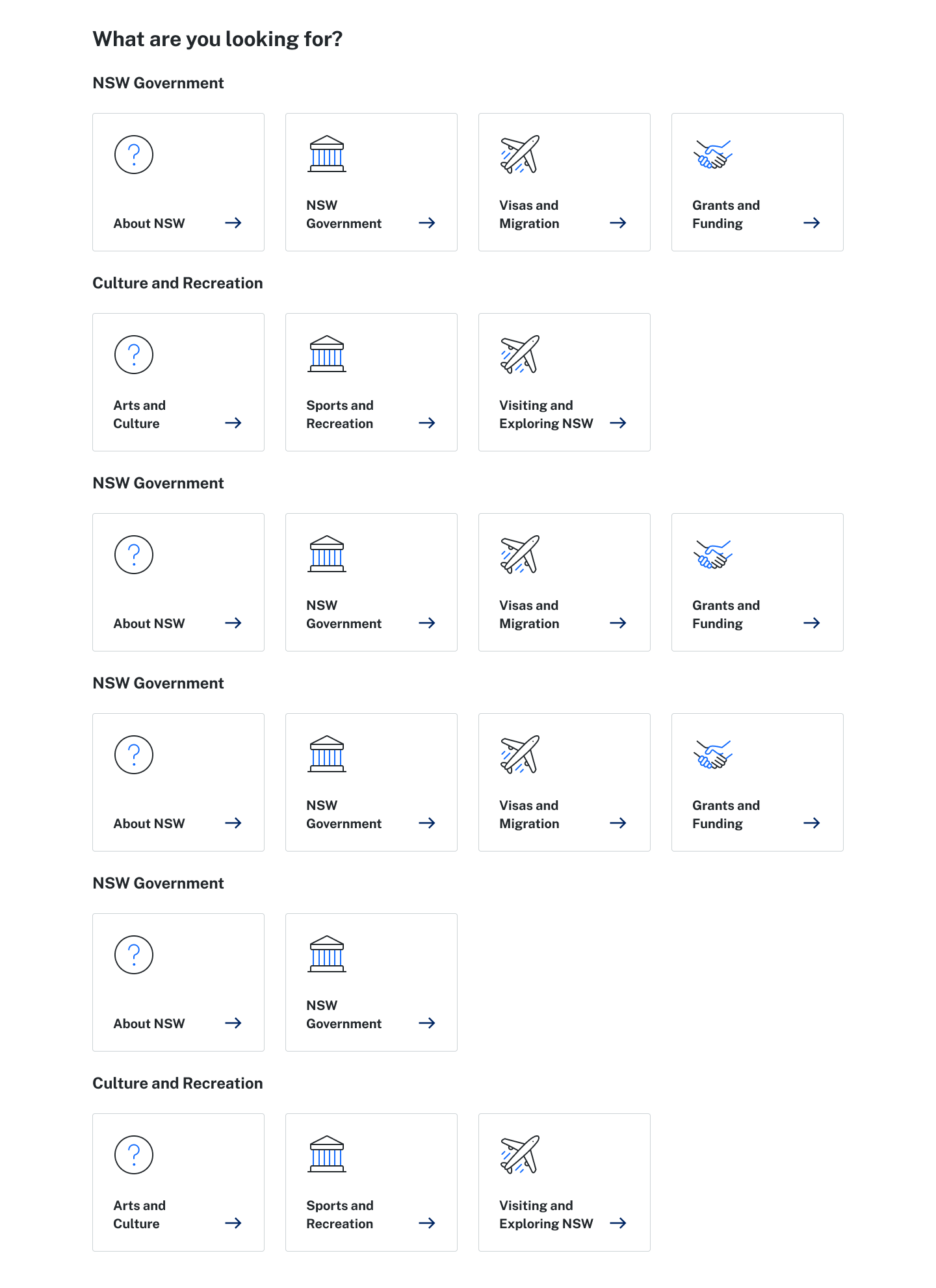
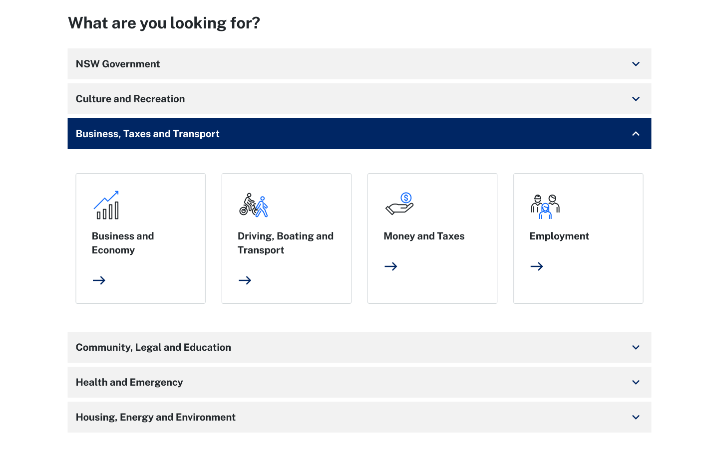
The nature of accordions is to hide information, which is the key problem of this project.
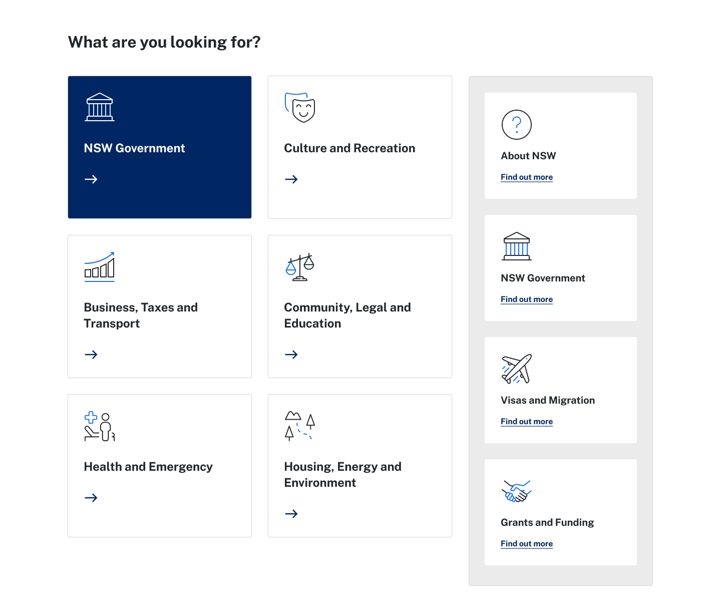
The UX of these content blocks were not feasible within the time dedicated to developing this feature.

The text in this button feature were deemed as too small.
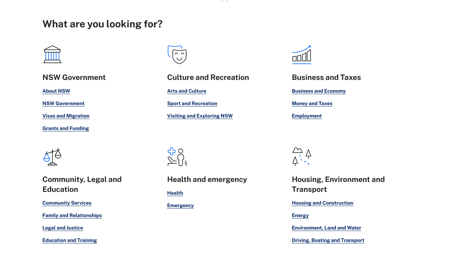
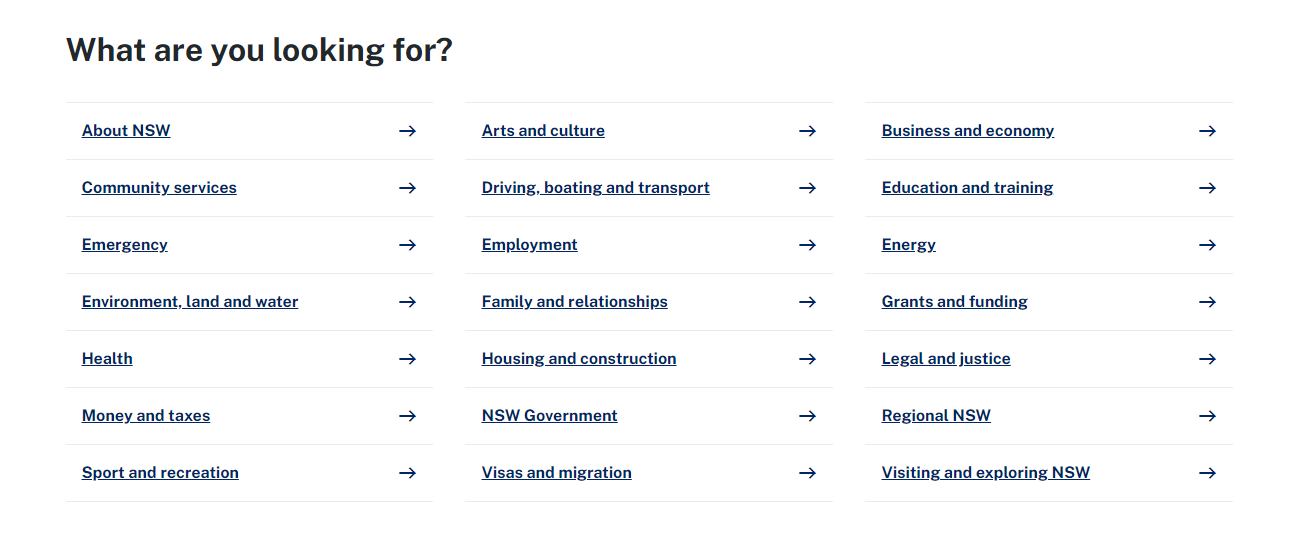
I landed on the two designs below, the 'categories' and 'links list', which fulfil the following criteria I concluded would provide the quickest and most comfortable experience:
- can be viewed on one screen without the user scrolling
- responsive design won't ridiculously extend the length of the screen
- contains all 20 topic links
- can be viewed on one screen without the user scrolling
- responsive design won't ridiculously extend the length of the screen
- contains all 20 topic links
The decision to change the feature name from 'Suggested topics' to 'What are you looking for?' was based on my intention of framing the language on the website as friendlier and more direct, in line with the government tone.
TESTING
I conducted card-sorting using Optimal Workshop Card Sorting to distinguish how users of the website would categorise the 20 different topic links.
At the same time, I worked with the development team to facilitate live A/B testing on the website. This was to validate which design out of the two would receive more clickthrough rates (CTR). I hypothesised that the 'categories' feature would receive more CTR than the 'links list'. This hypothesis was proven wrong, as the 'links list' received more, showing that our users prioritised a wholistic view of all the options available to them.
The second A/B test was conducted to understand the best placement of the feature, to prove my hypothesis that the higher placement would allow for high CTR. The test indeed resulted in higher CTR, validating that the feature needed to be placed higher so that site visitors don't need to scroll to find it.


LEARNINGS
While I was unable to validate one of my hypotheses, I ultimately shipped the 'links list' feature to the homepage, improving main page views immediately on the website.
