Overview
Save Our Bees Australia required a rebranding to appeal to local communities in Sydney, including their target demographic of families.
Final Product Showcase
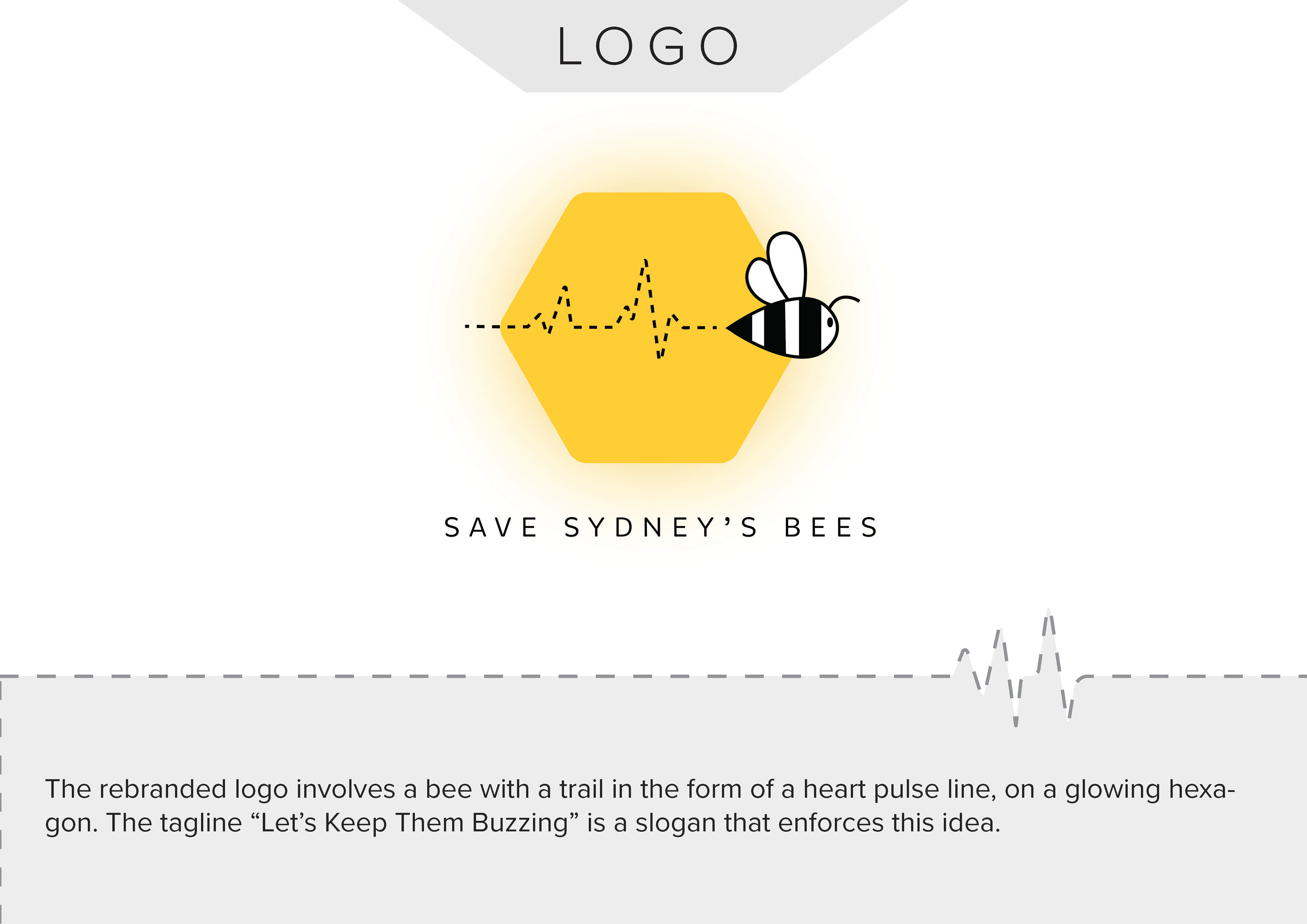
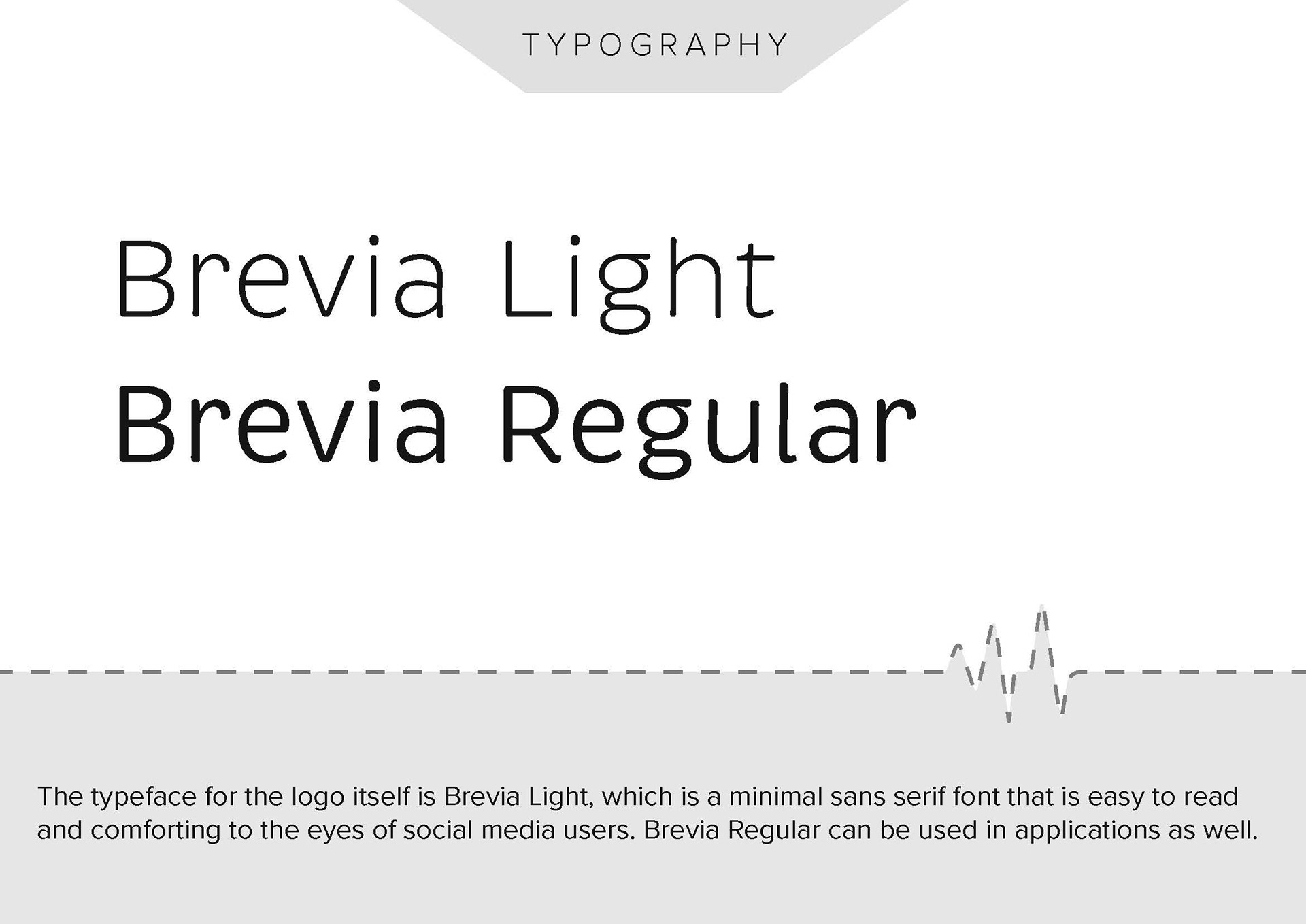
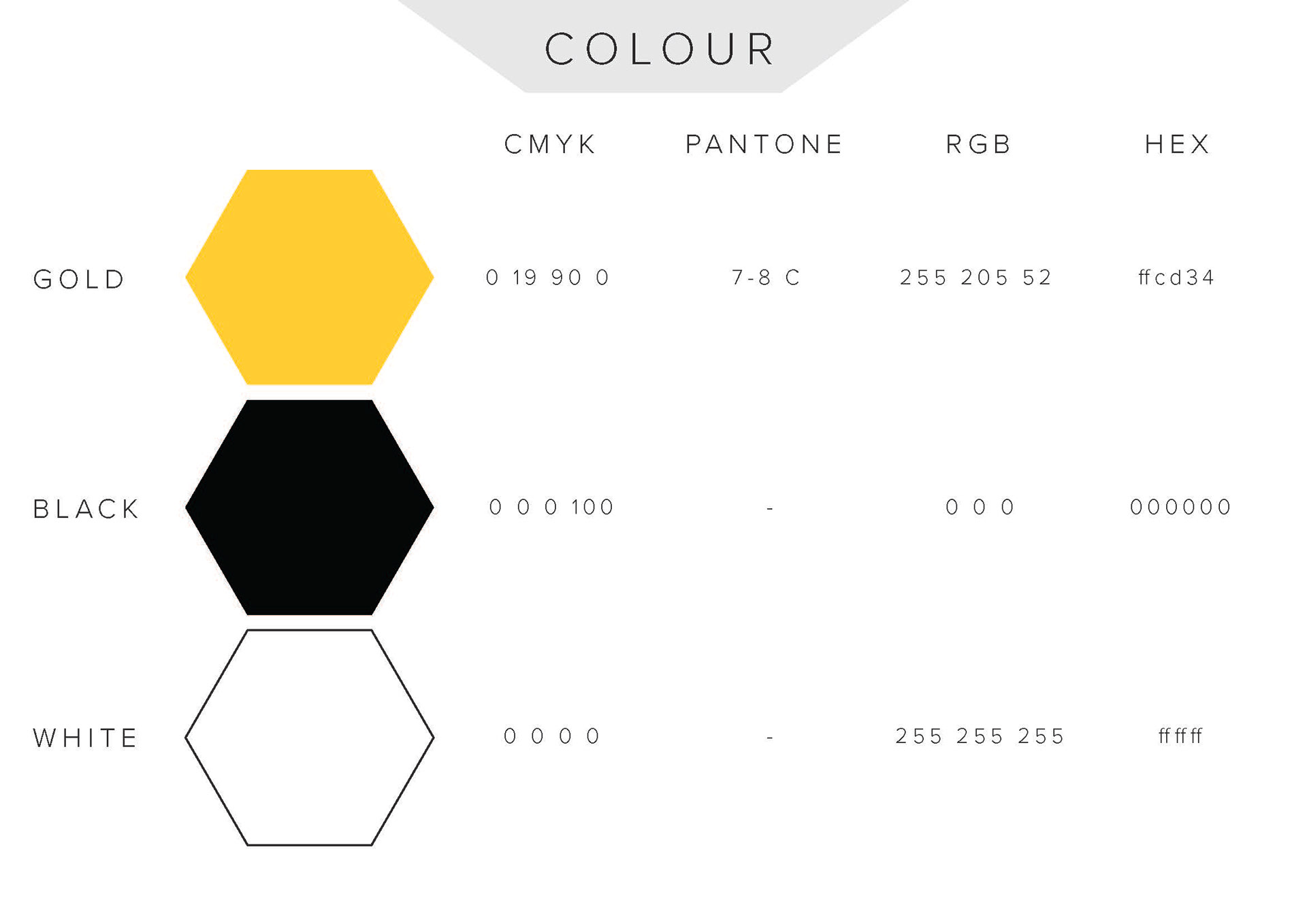
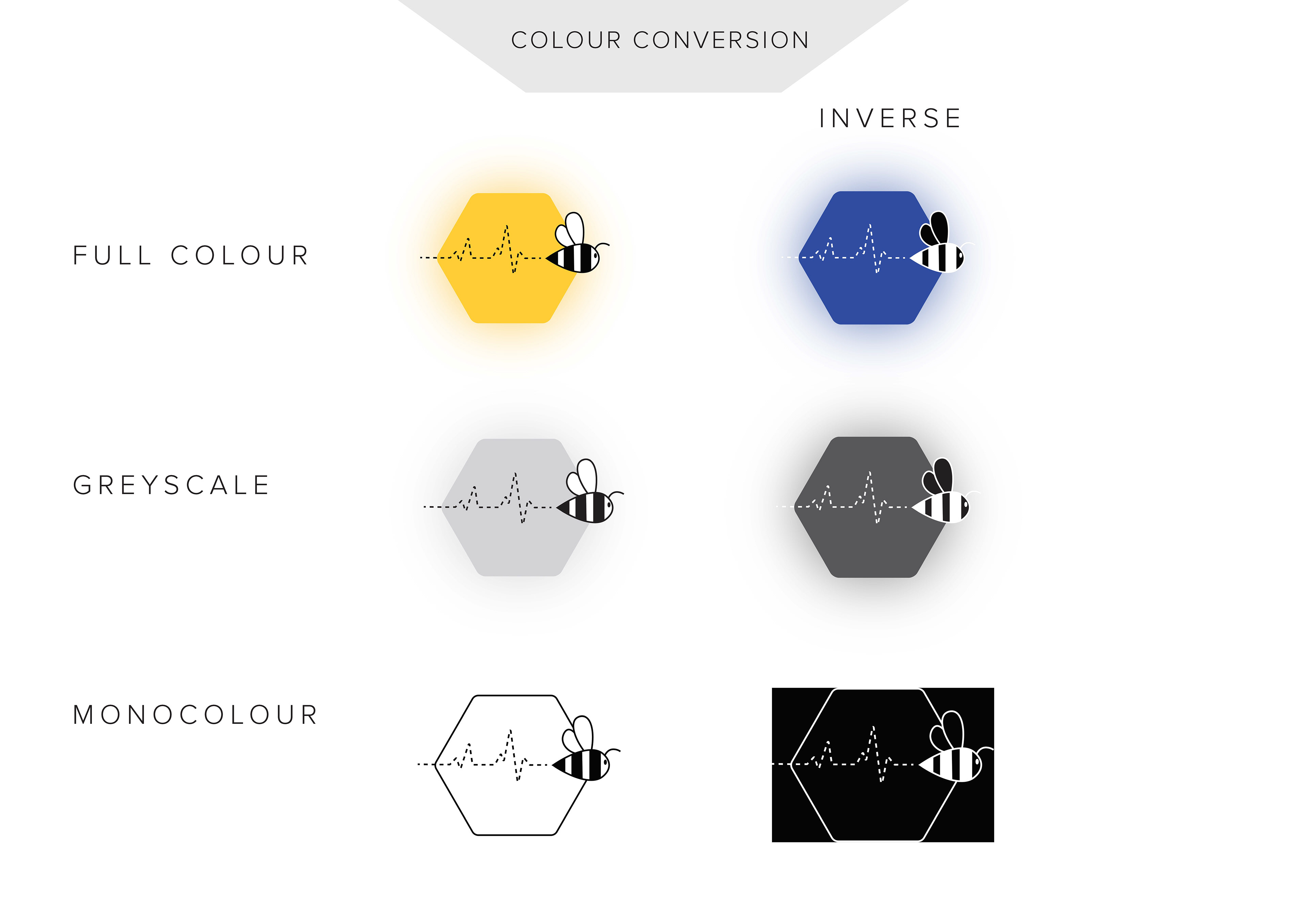
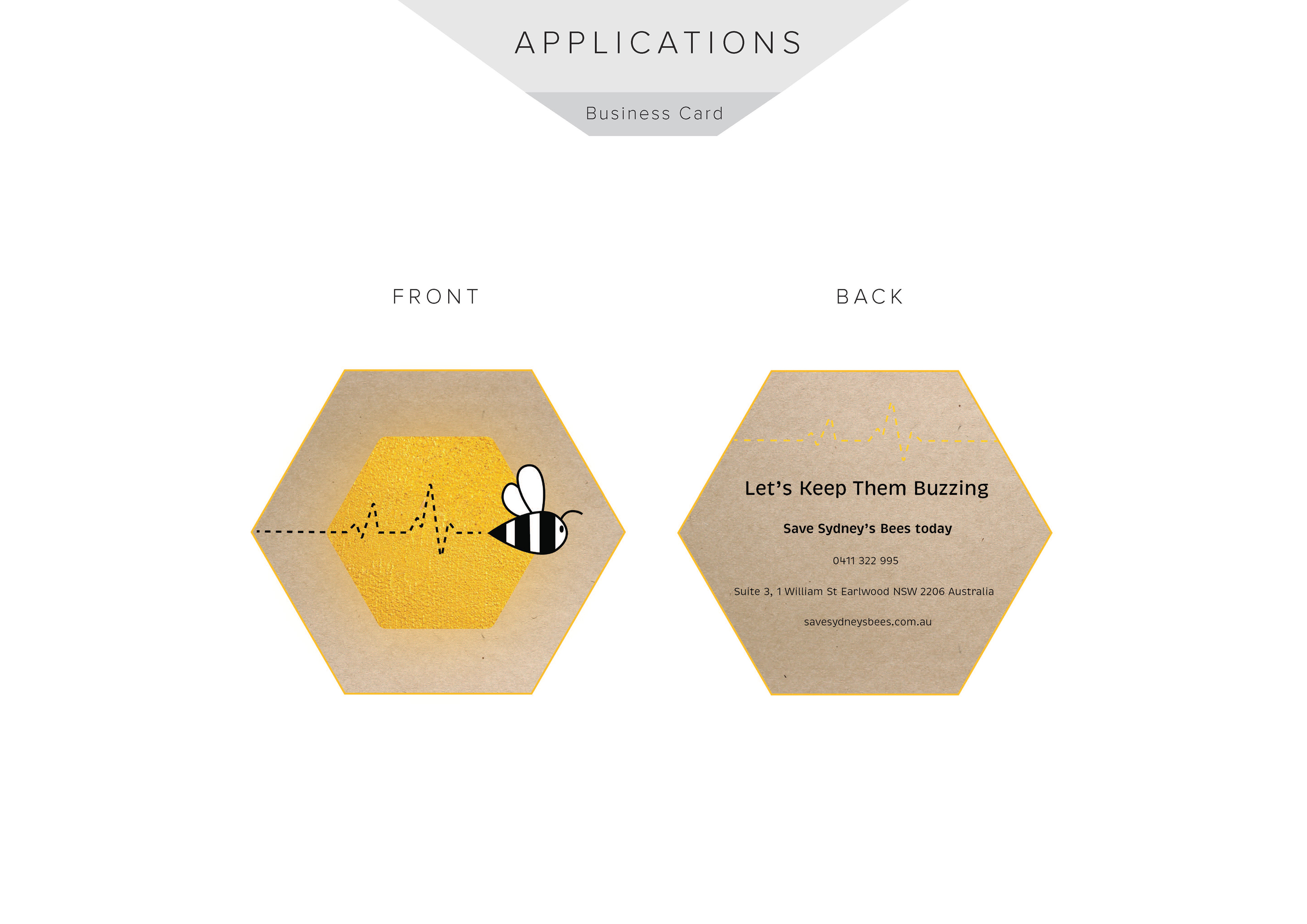
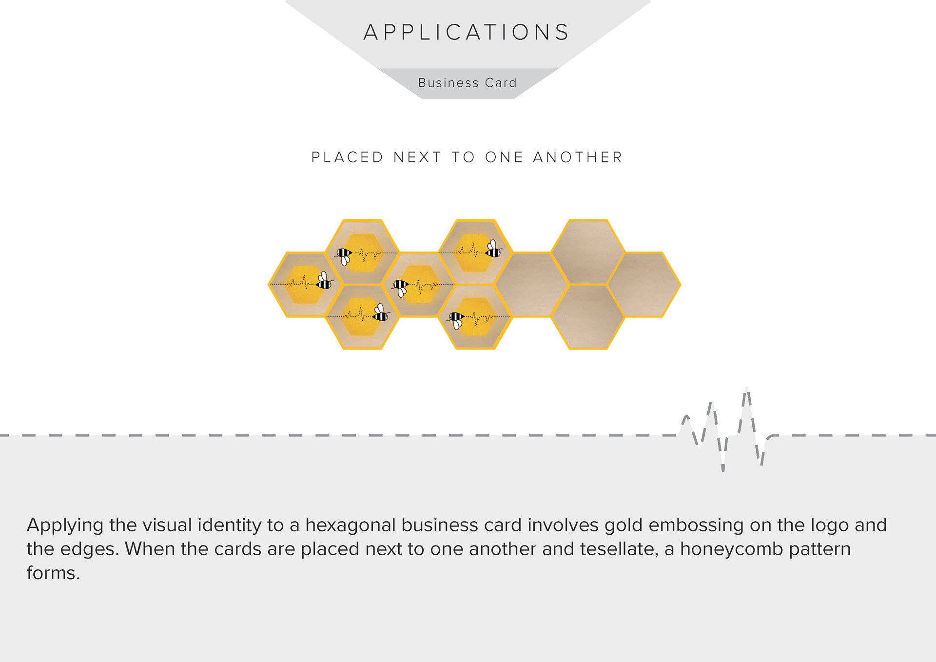
I developed the name, visual identity and style guide for Save Sydney's Bees, rebranding from Save Our Bees Australia. The re-design solution includes a logo, typeface, colour scheme and relevant small- and large-scale mock-ups. With a focus on logo design, the intention was to refine the pre-existing logo and branding from a realistic style to one that is more modern and inviting so that the community-based organisation can gain better reach in target demographics.
Process
Research
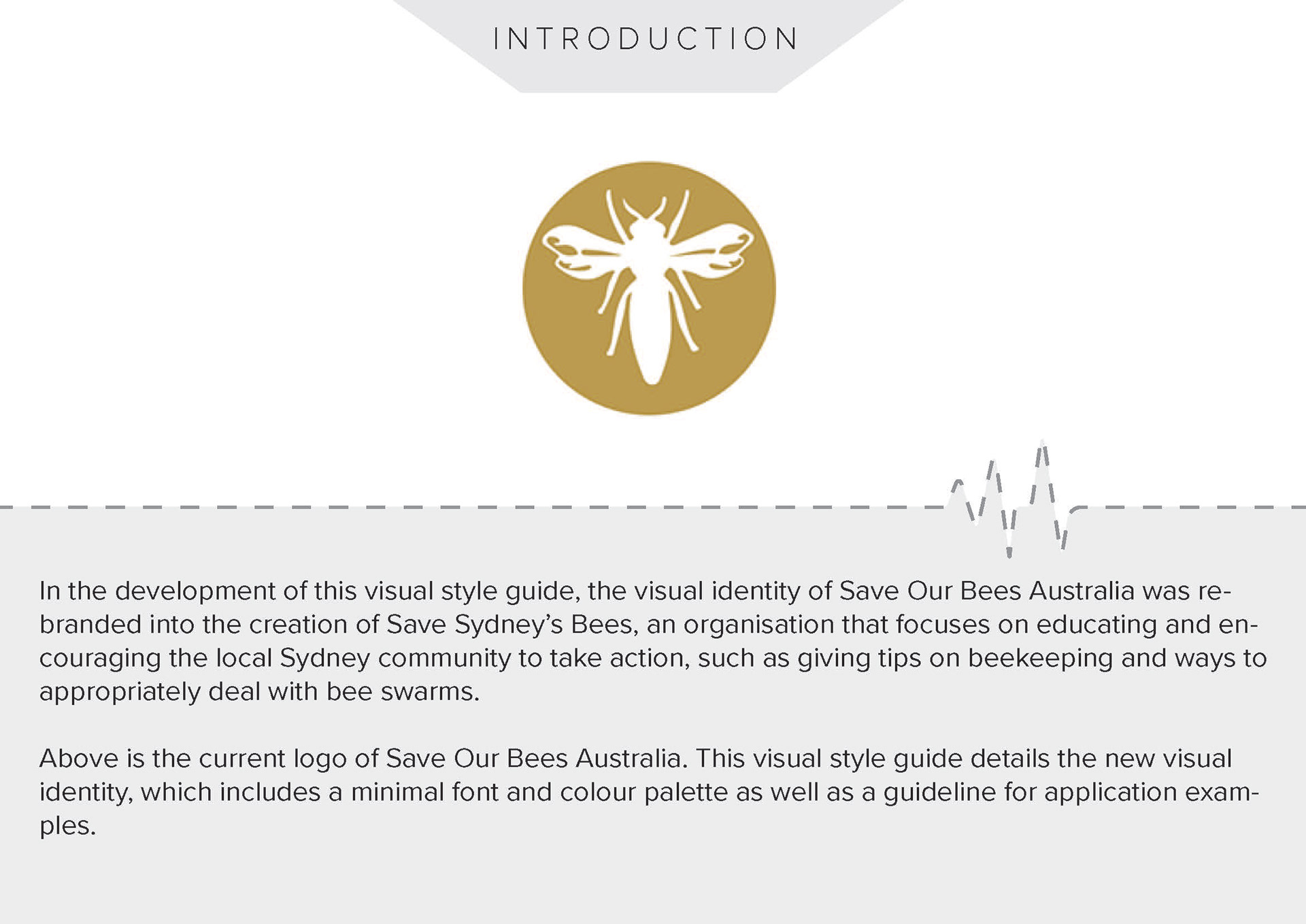
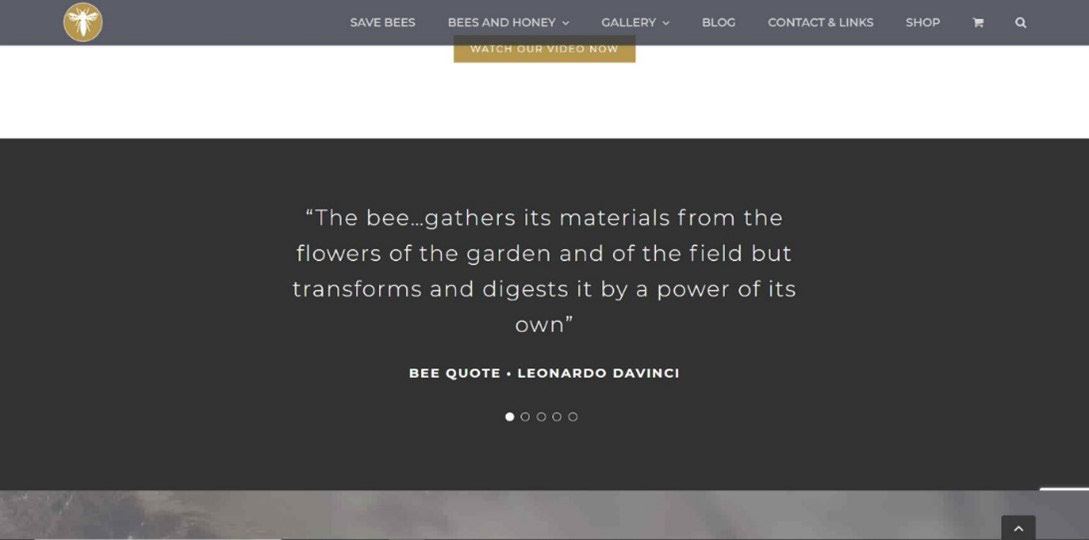
I began the rebranding process with a quick analysis of Save Our Bees' current logo and branding. With not much of a colour palette and memorable logo, it was time to create something that would pop and remain in their audiences' minds.
I began the rebranding process with a quick analysis of Save Our Bees' current logo and branding. With not much of a colour palette and memorable logo, it was time to create something that would pop and remain in their audiences' minds.
Ideation
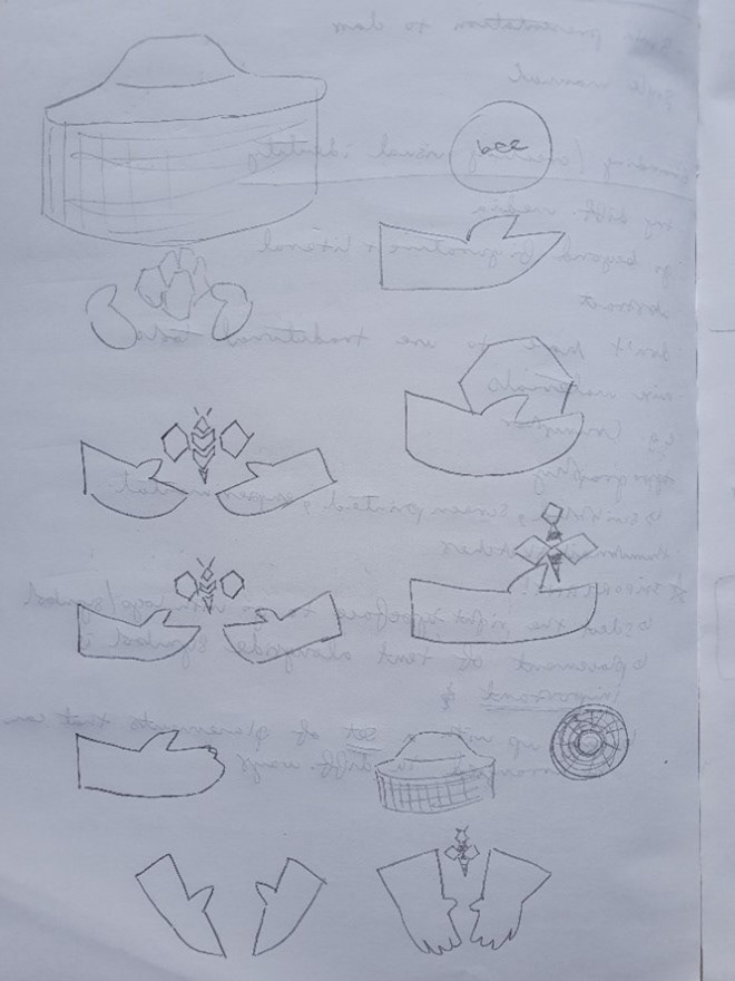
The initial brainstorm showed many obvious symbols of "helping" or "saving" bees, such as beekeeper, gloves and hexagon hives.
The initial brainstorm showed many obvious symbols of "helping" or "saving" bees, such as beekeeper, gloves and hexagon hives.
Digital Translation
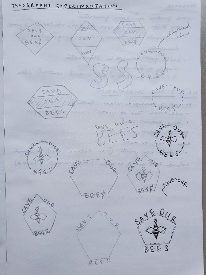
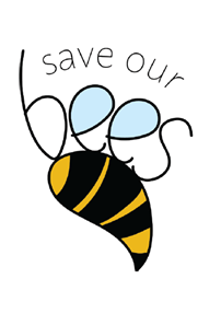
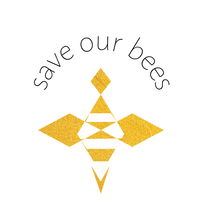
The next step was to translate sketches into Adobe Illustrator; however, not only did I have issues with typography but they were not conveying the intended message.
The next step was to translate sketches into Adobe Illustrator; however, not only did I have issues with typography but they were not conveying the intended message.
A breakthrough!
To symbolise the concept of 'helping' bees, I incorporated the lifeline in the middle of the hexagon in the next iteration.
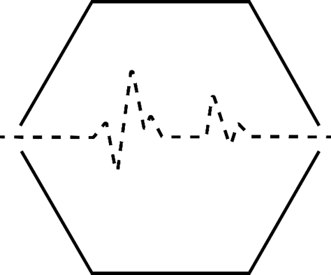
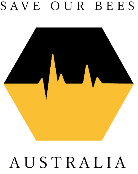
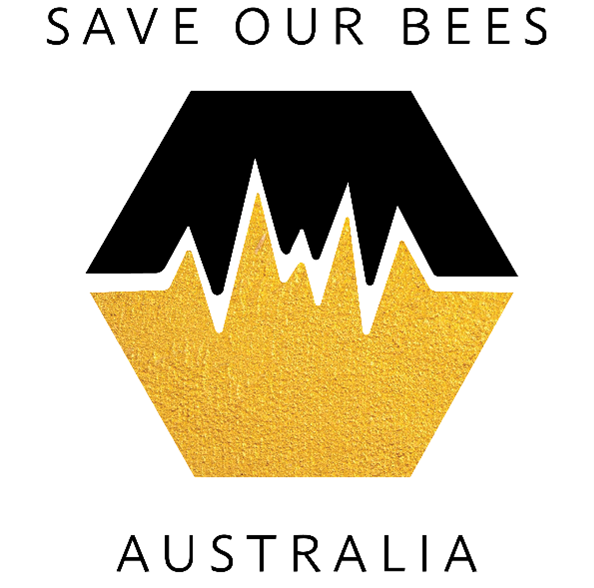
You can see the final logo coming through in new sketches incorporating the 'lifeline' idea. I combined this with a bee cartoon to relate the logo to the main concept of bees.
Final Iterations
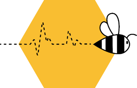
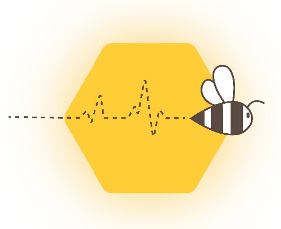
Finally, digitalisation of the sketches has brought us to the final product. Here are a couple iterations, the first one without rounded corners and the second using brown outlines instead of black.
Finally, digitalisation of the sketches has brought us to the final product. Here are a couple iterations, the first one without rounded corners and the second using brown outlines instead of black.
