Overview
BEACHFOX is a sunscreen brand that recently required an update of its brand guidelines. Mentored by BeingIconic's Chief Design Officer, I was encouraged to think creatively rather than to use one template throughout the entire guidelines. This process involved much of filling up gaps that the original guidelines were missing and experimenting from an artistic perspective to capture the fun and quirky elements of the BEACHFOX brand.
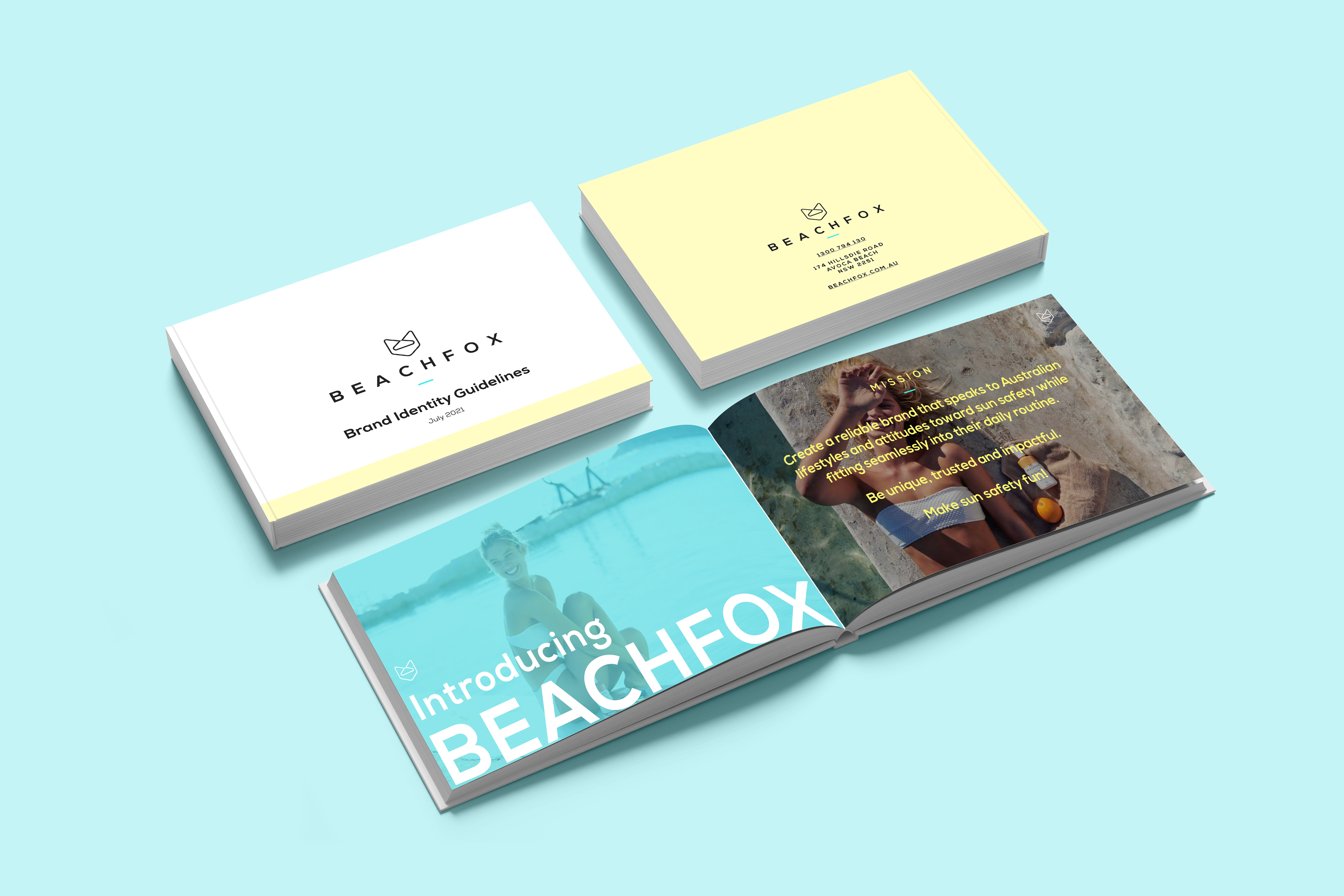
Final Product Showcase
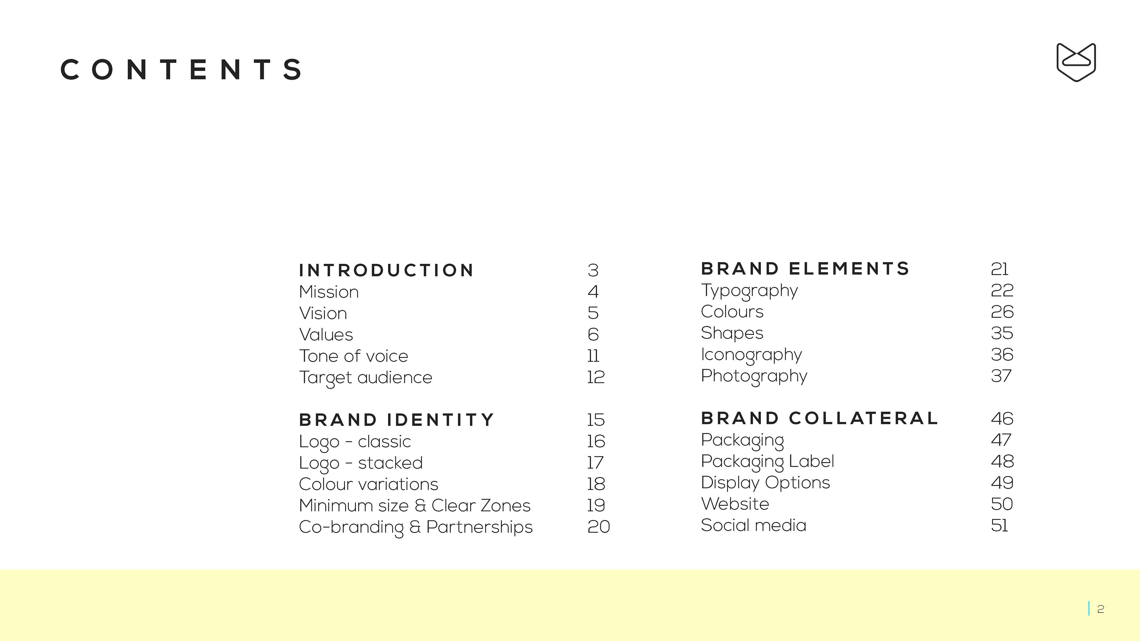
Contents
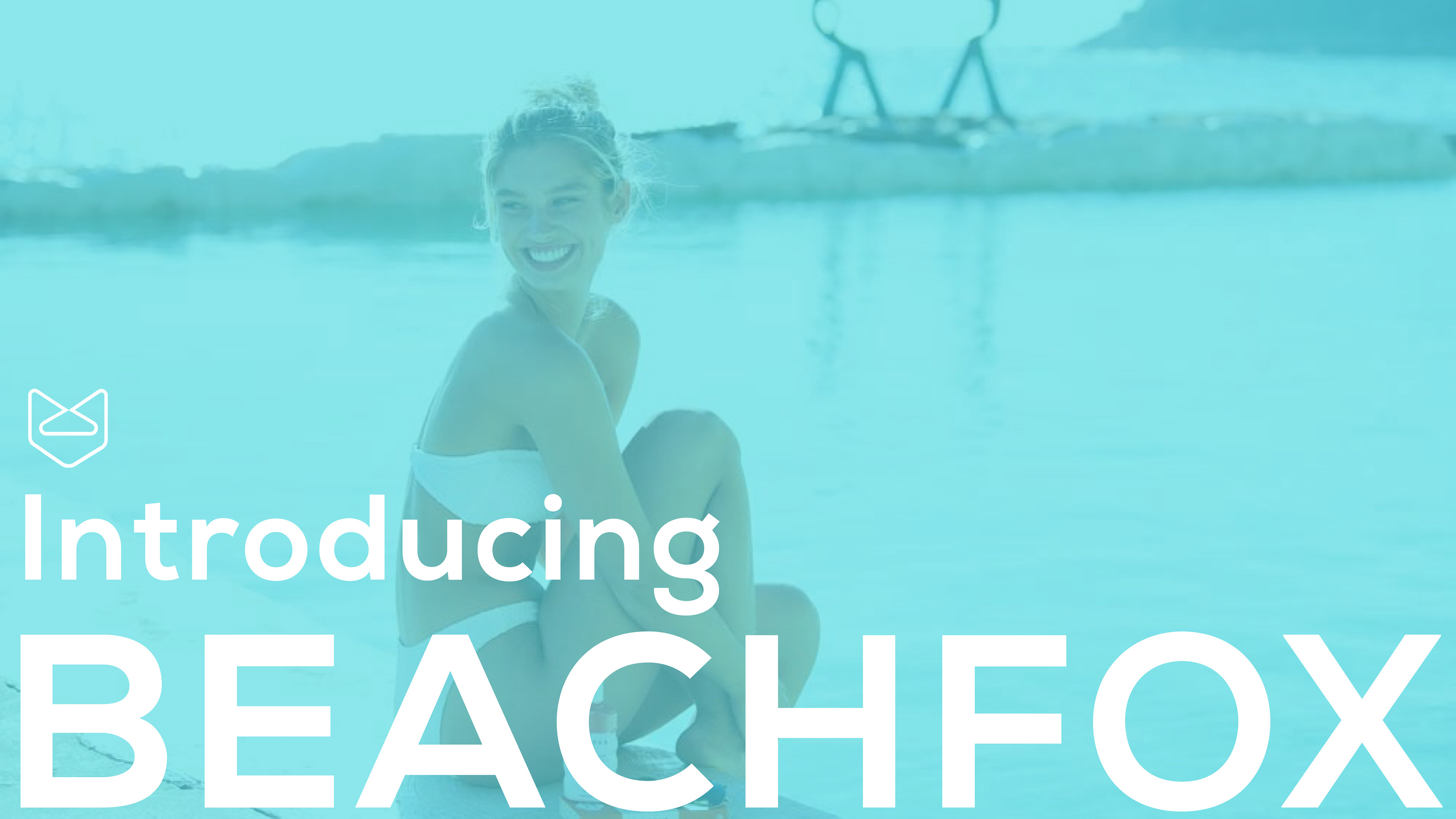
Title Card 2
The layout of the contents page establishes the general layout for the majority of the pages (below). Beginning from the cover page, the yellow bar at the bottom expands in area, symbolising sunbeam filling the page; this is a fun little idea that involves a bit of interactivity as the viewer may find it a pleasant surprise when they notice it. The title cards convey feelings of being outdoors during summertime. These aspects altogether define the essentials of the BEACHFOX concept - summer, liveliness and relaxation on the beach.
While the first few pages have a certain consistent layout, I treated the rest of the pages as full-page magazine spreads rather than just a document, and attempted to create an impact.
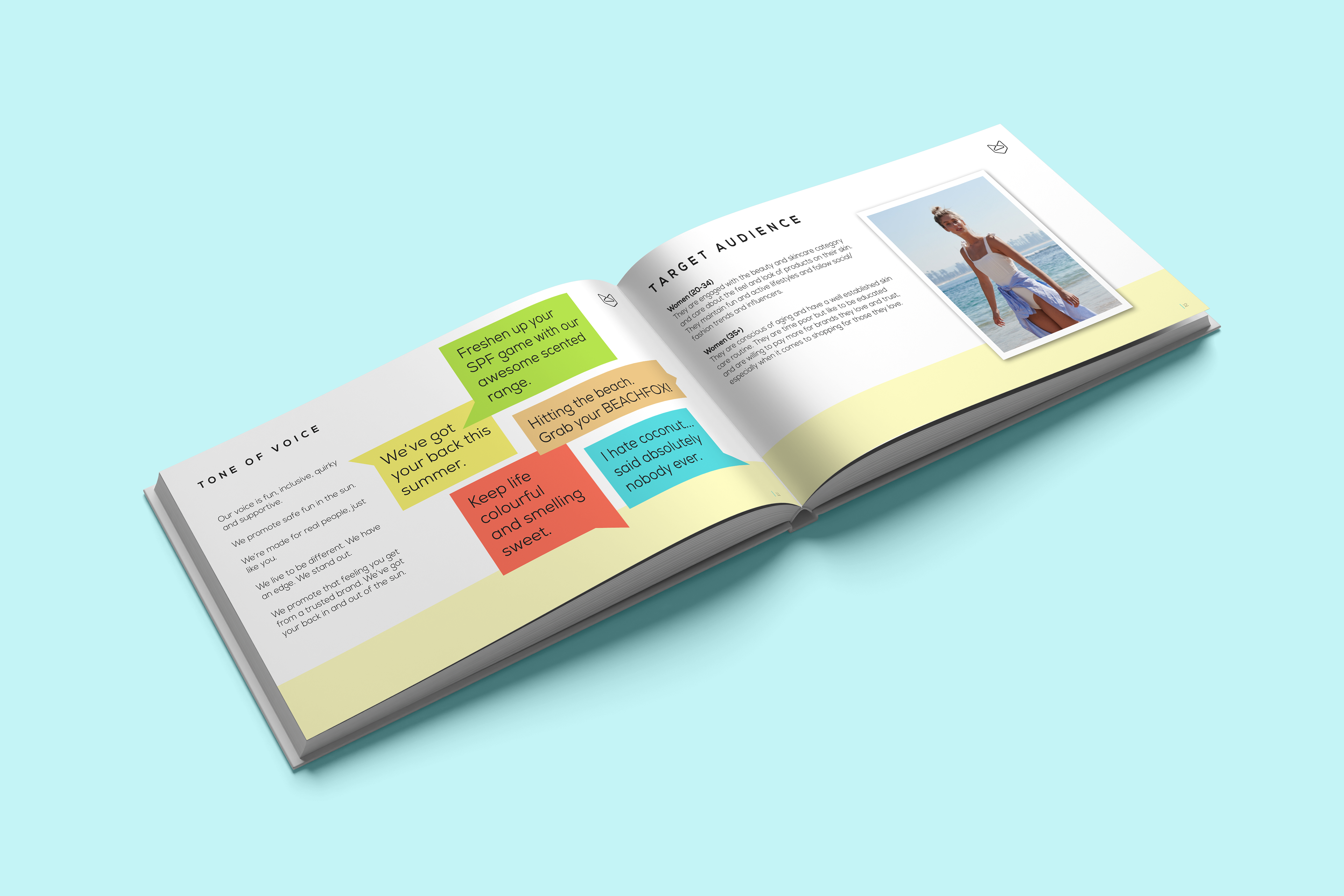
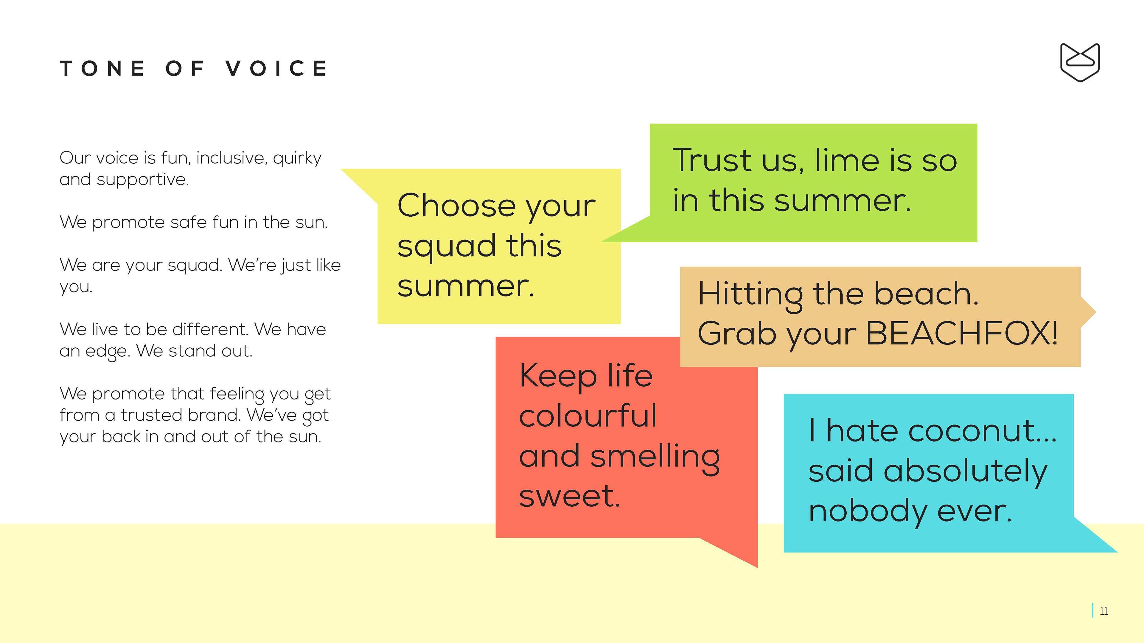
Tone of voice
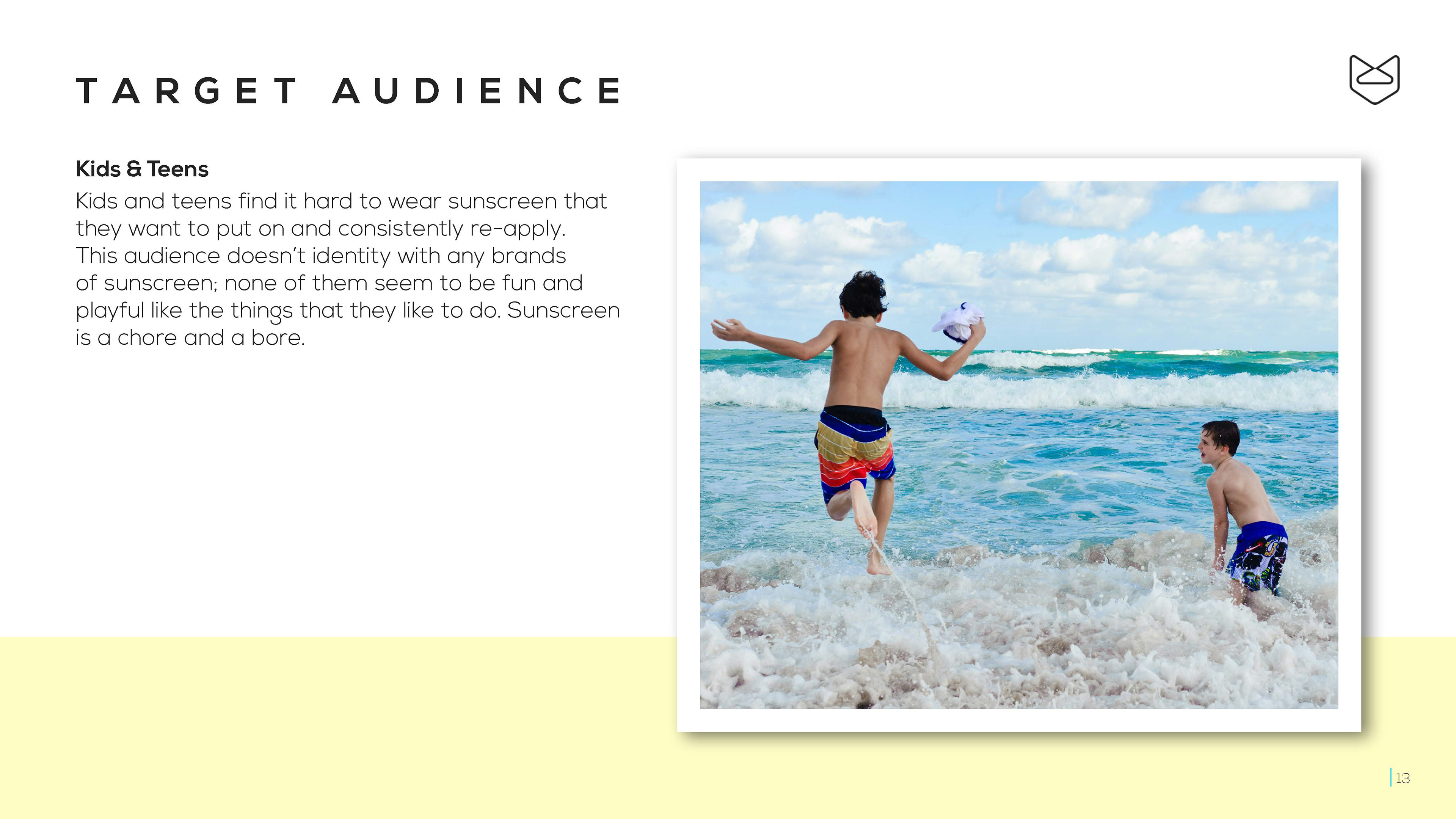
Target audience
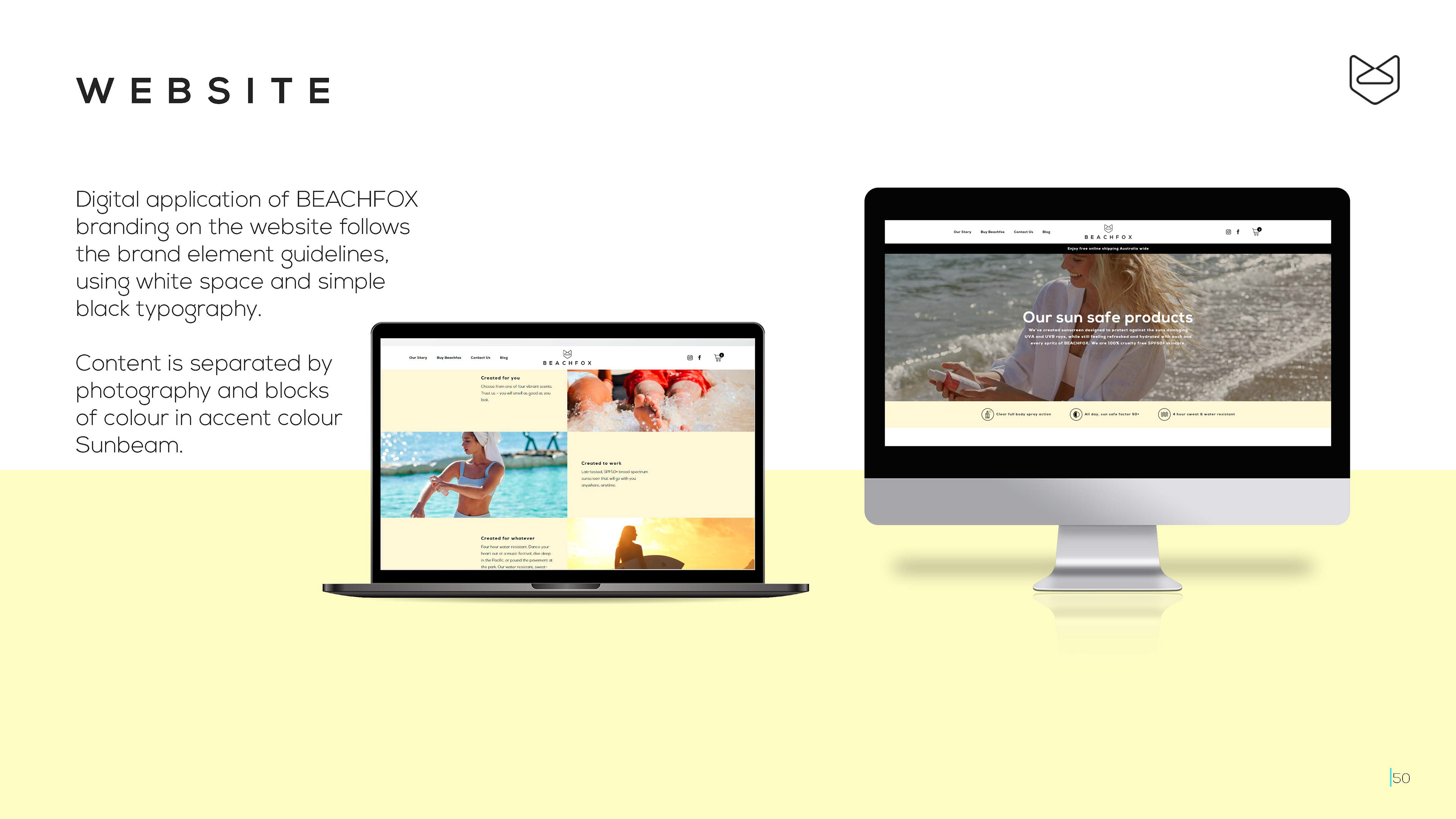
Website mockups
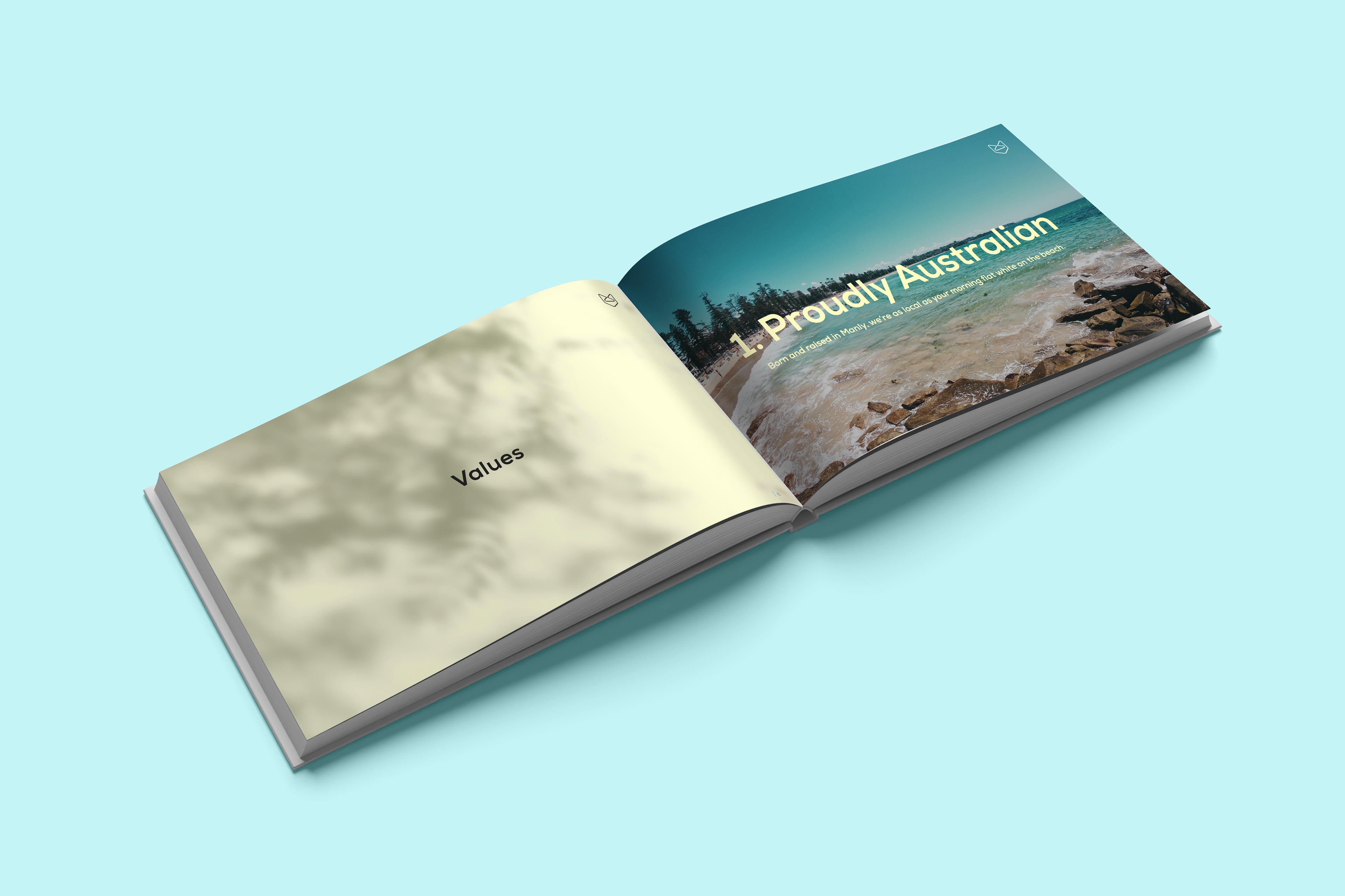
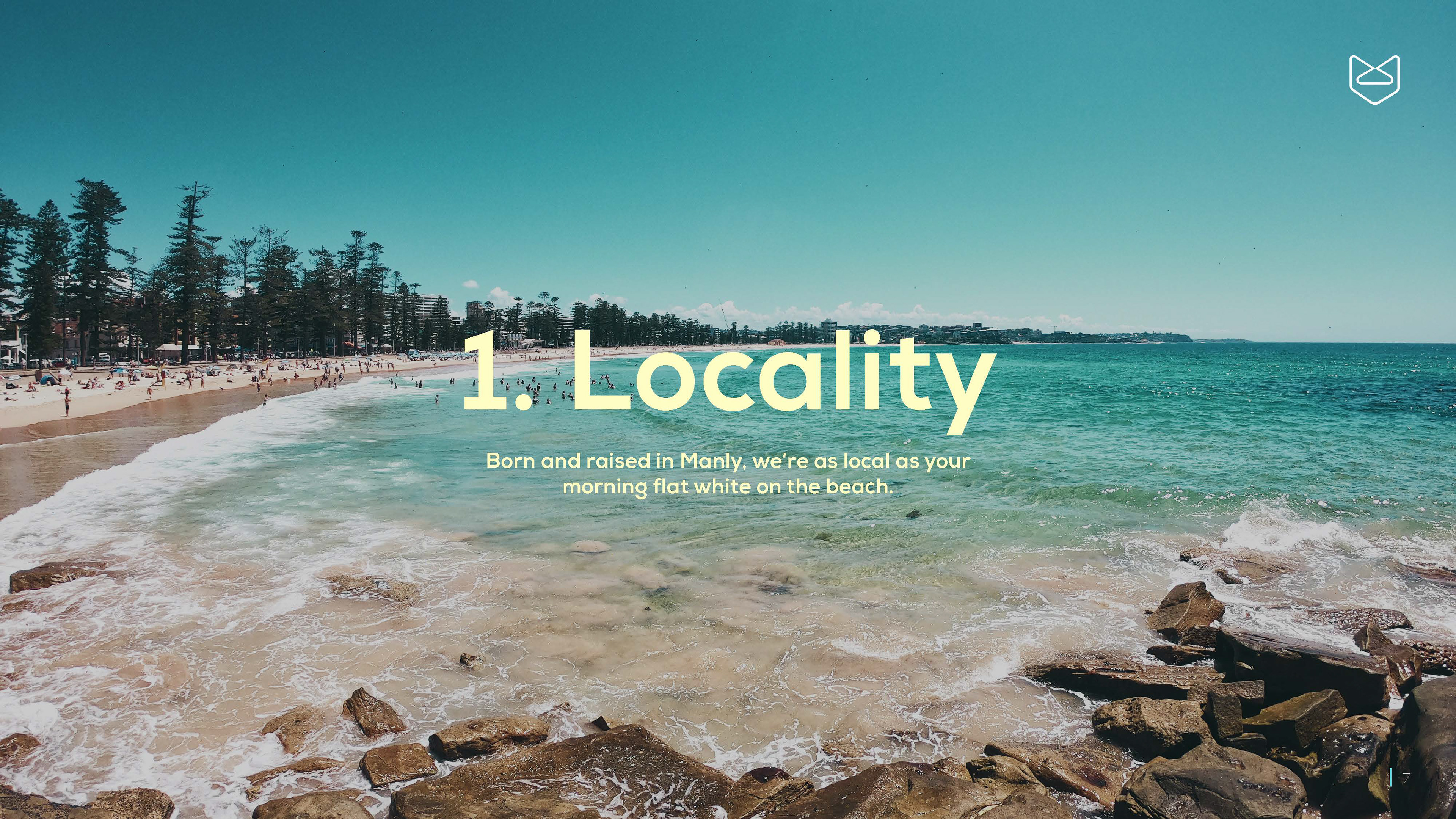
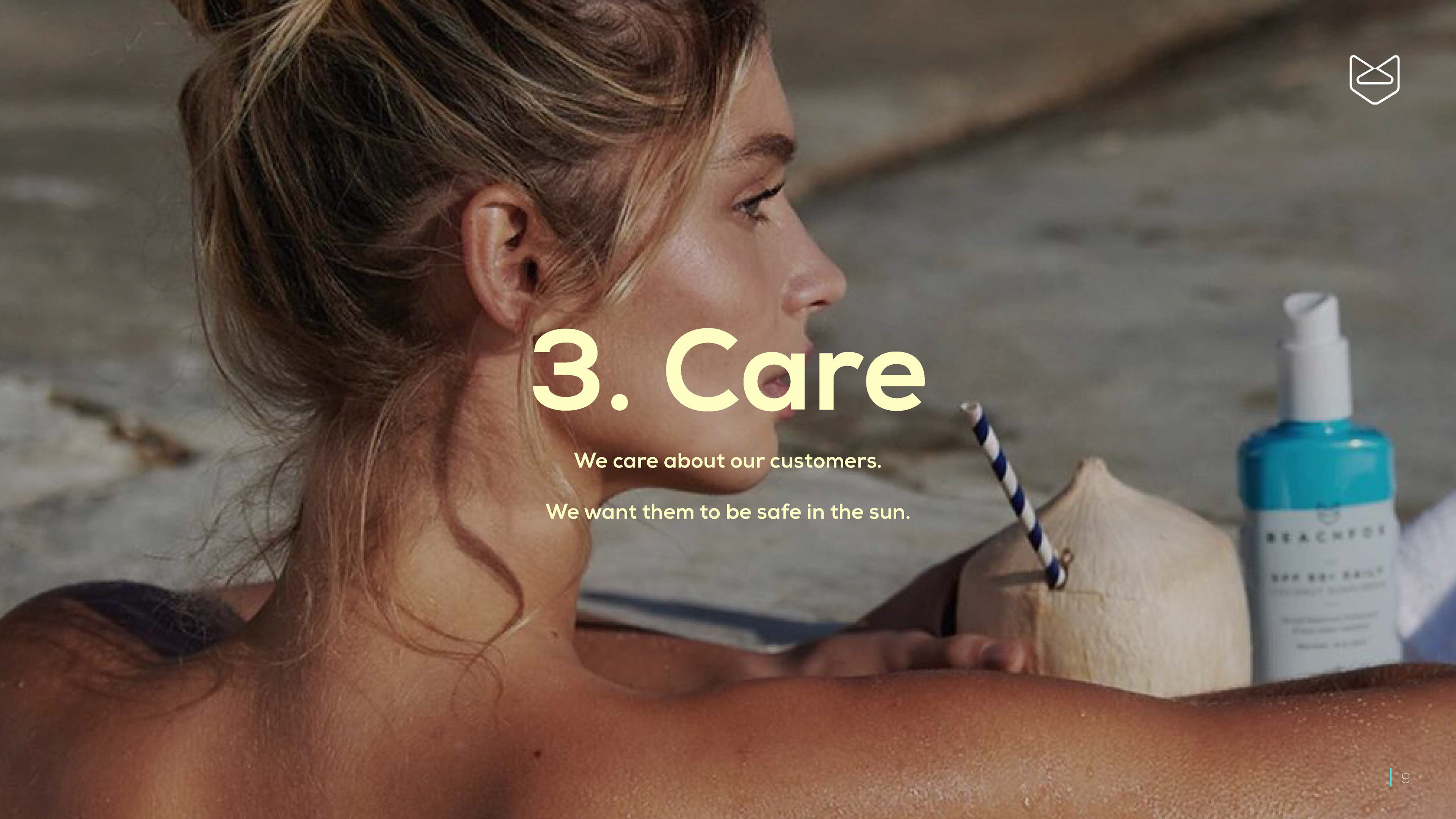
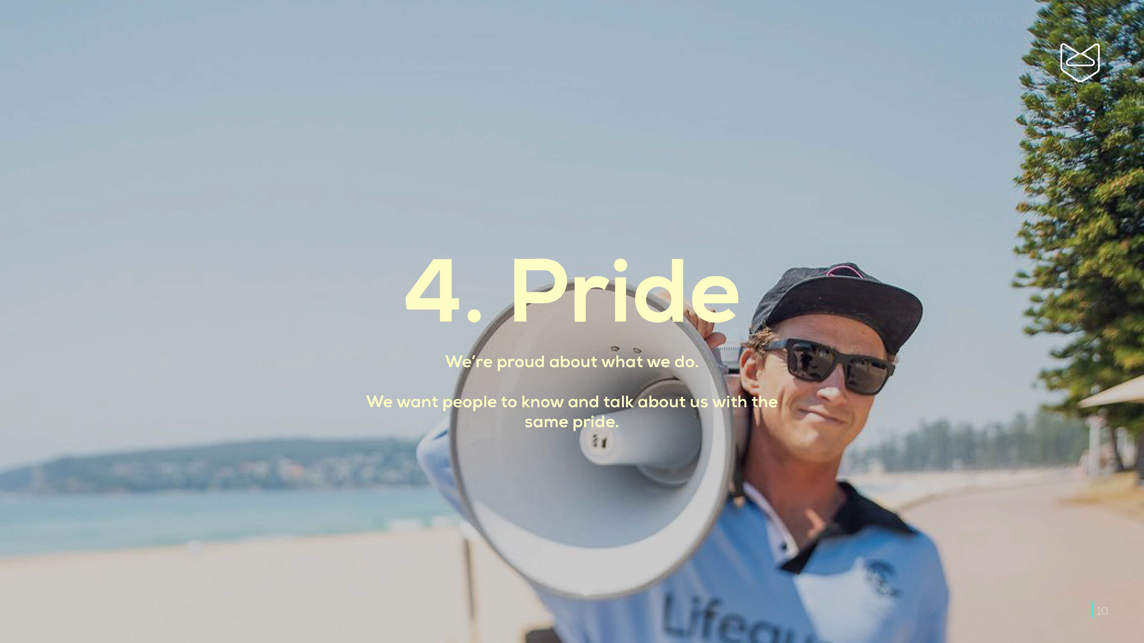
VALUES
I positioned BEACHFOX's "Who are we?" factors as values instead, so that BEACHFOX can attribute their mission and vision to these basic four pillars of business.
I positioned BEACHFOX's "Who are we?" factors as values instead, so that BEACHFOX can attribute their mission and vision to these basic four pillars of business.

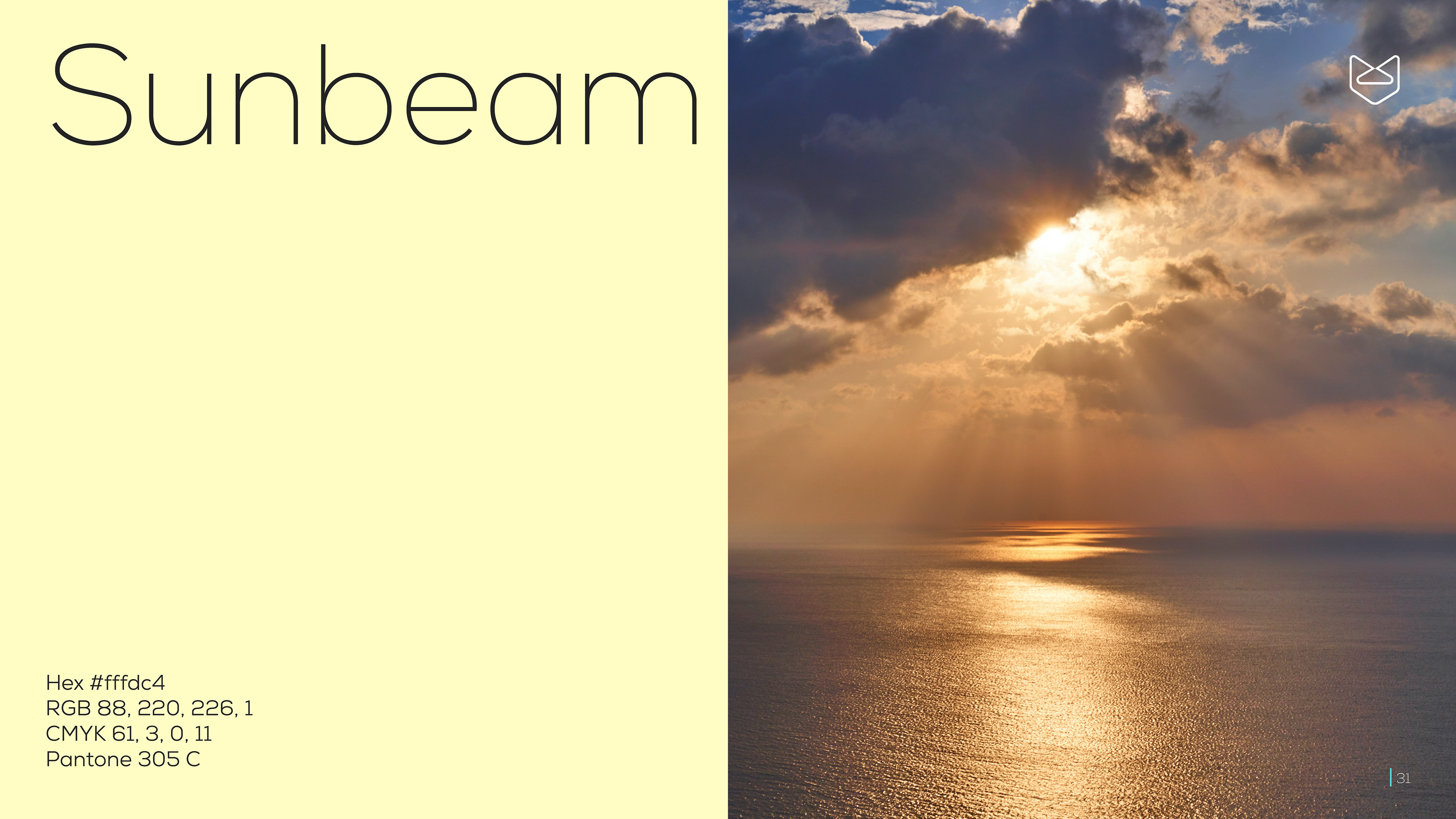
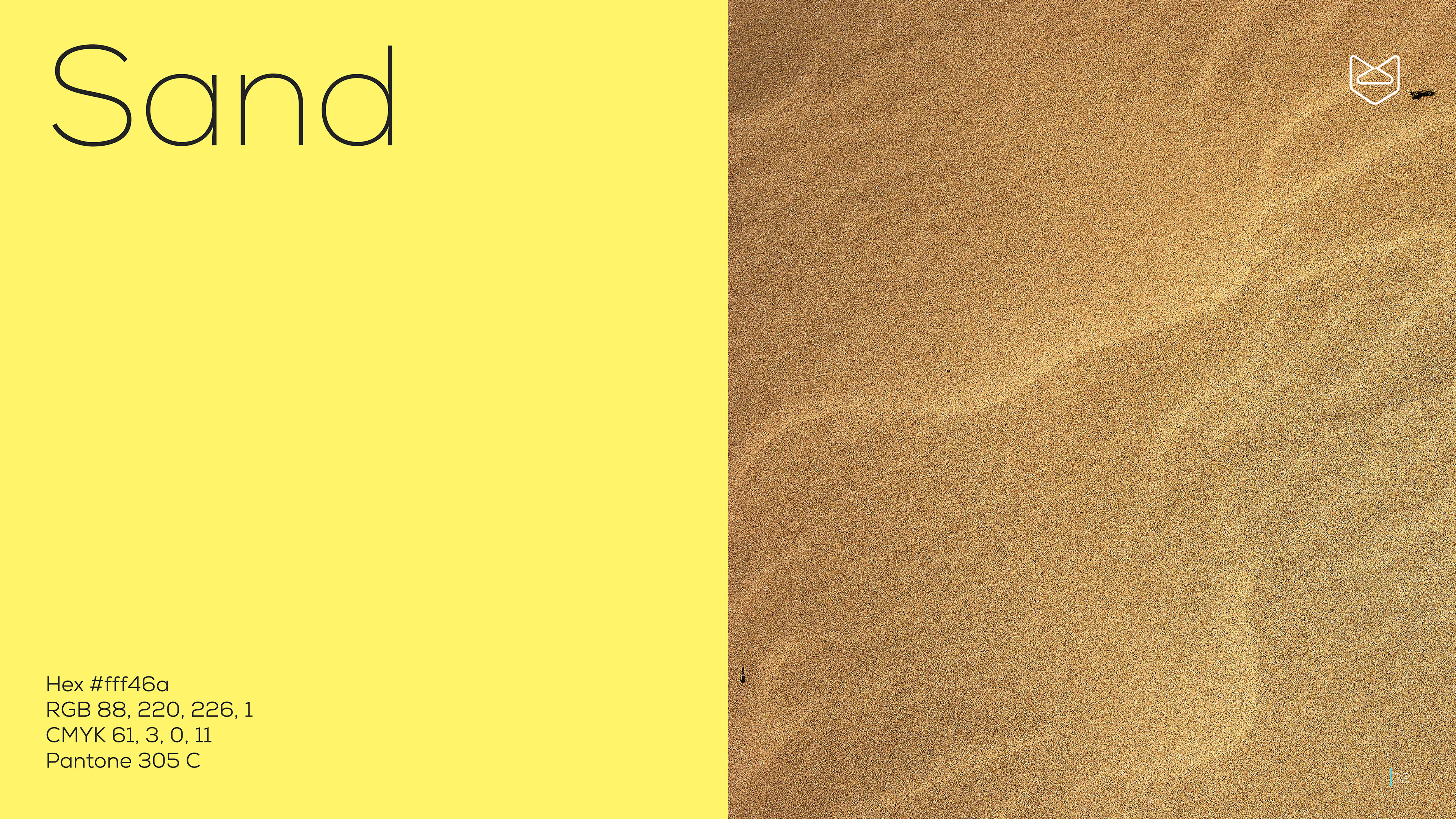
Colours
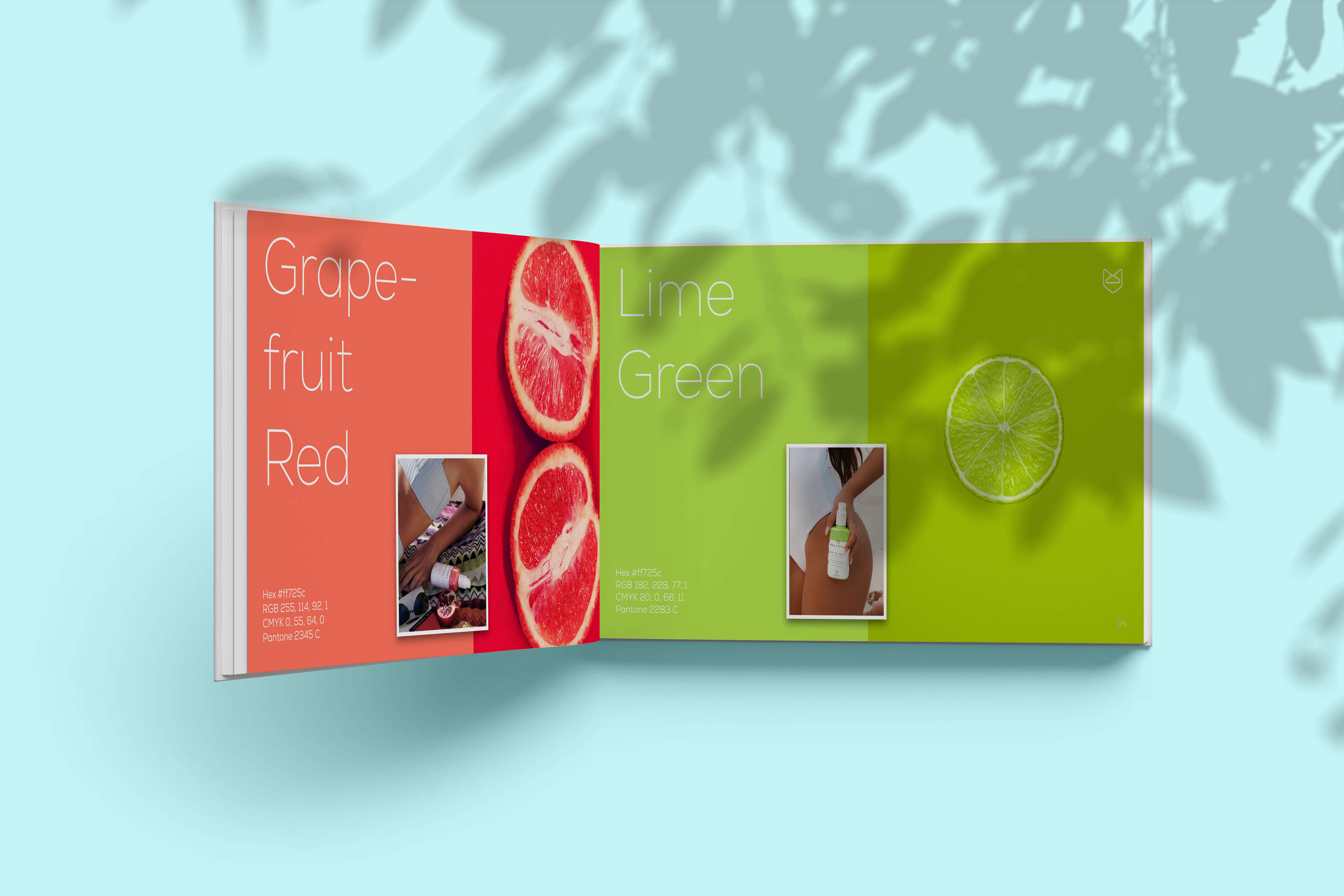
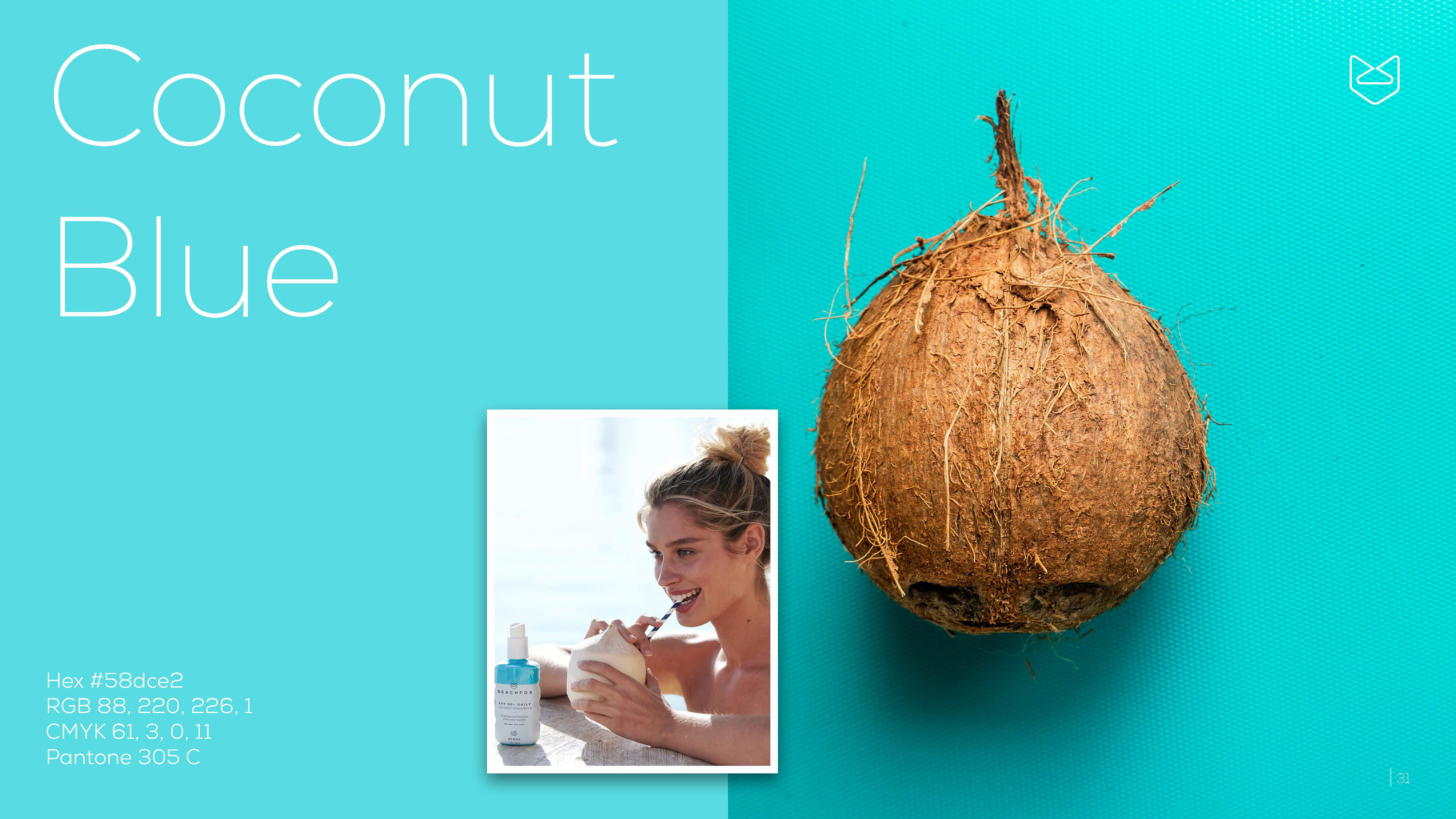
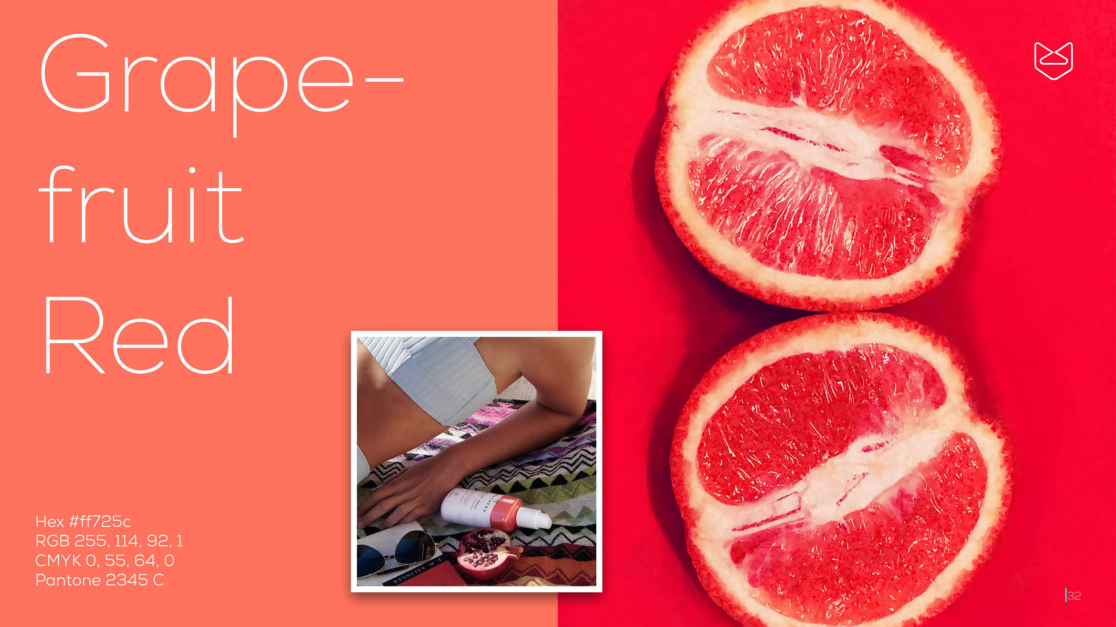
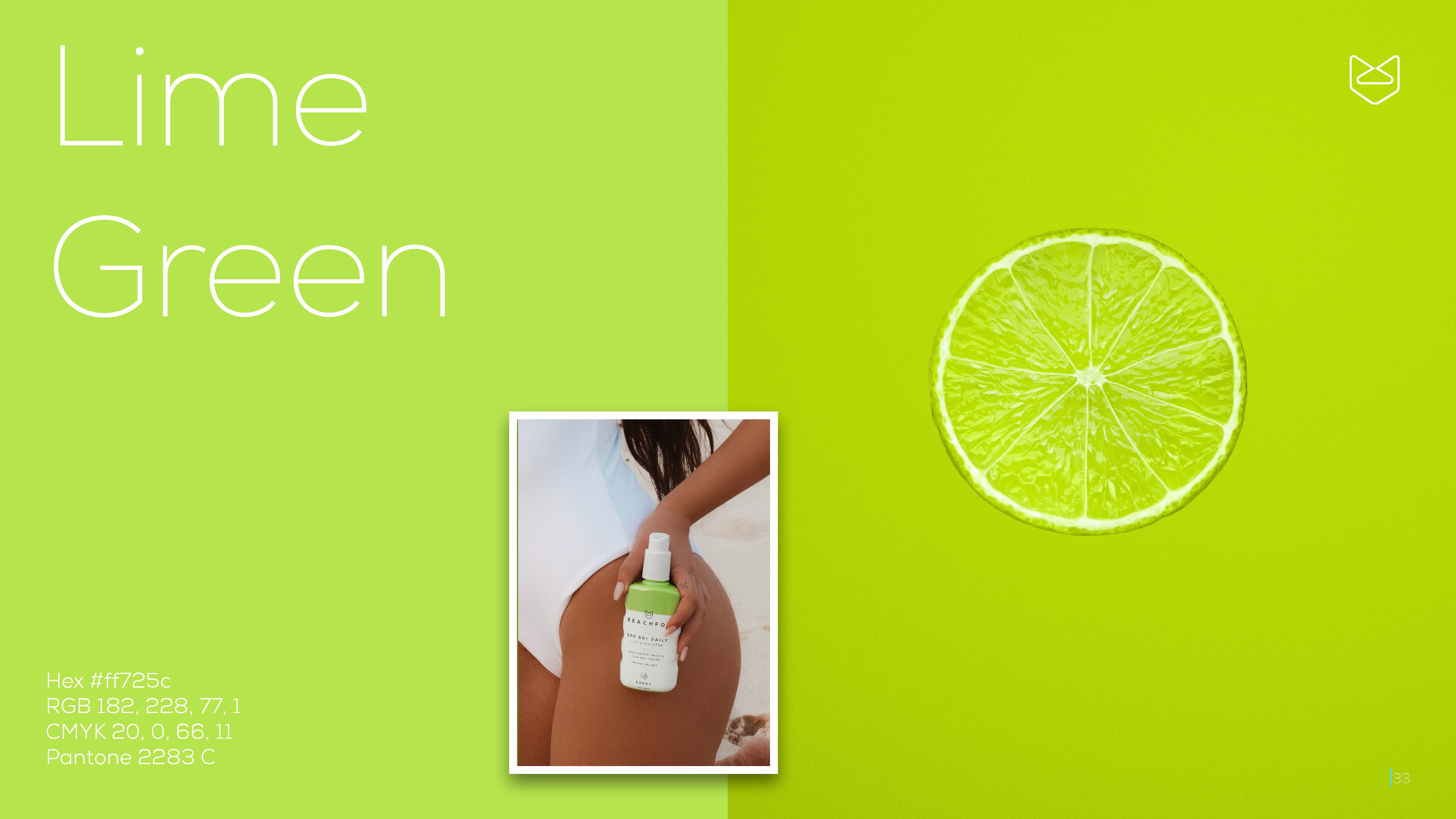
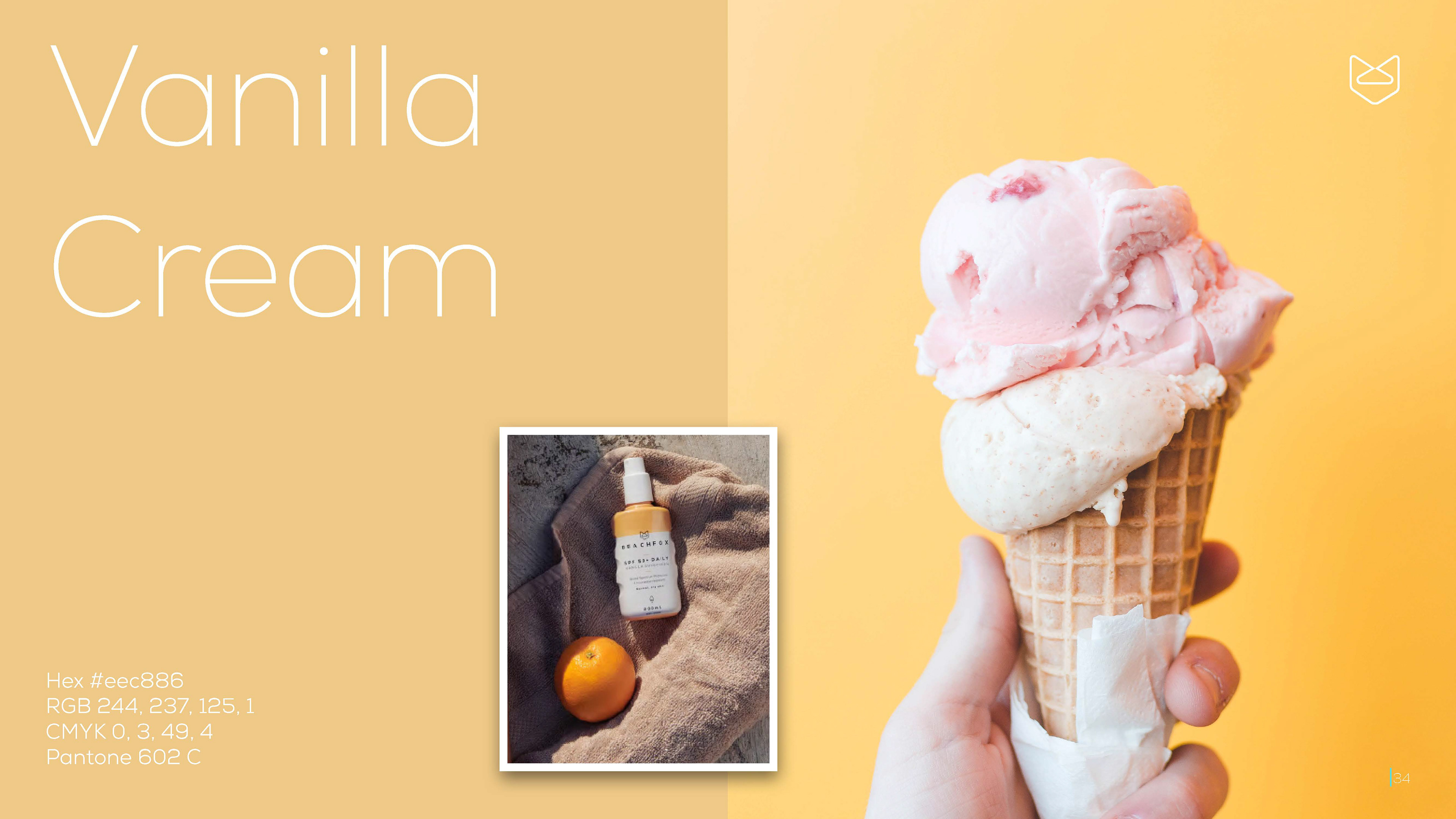
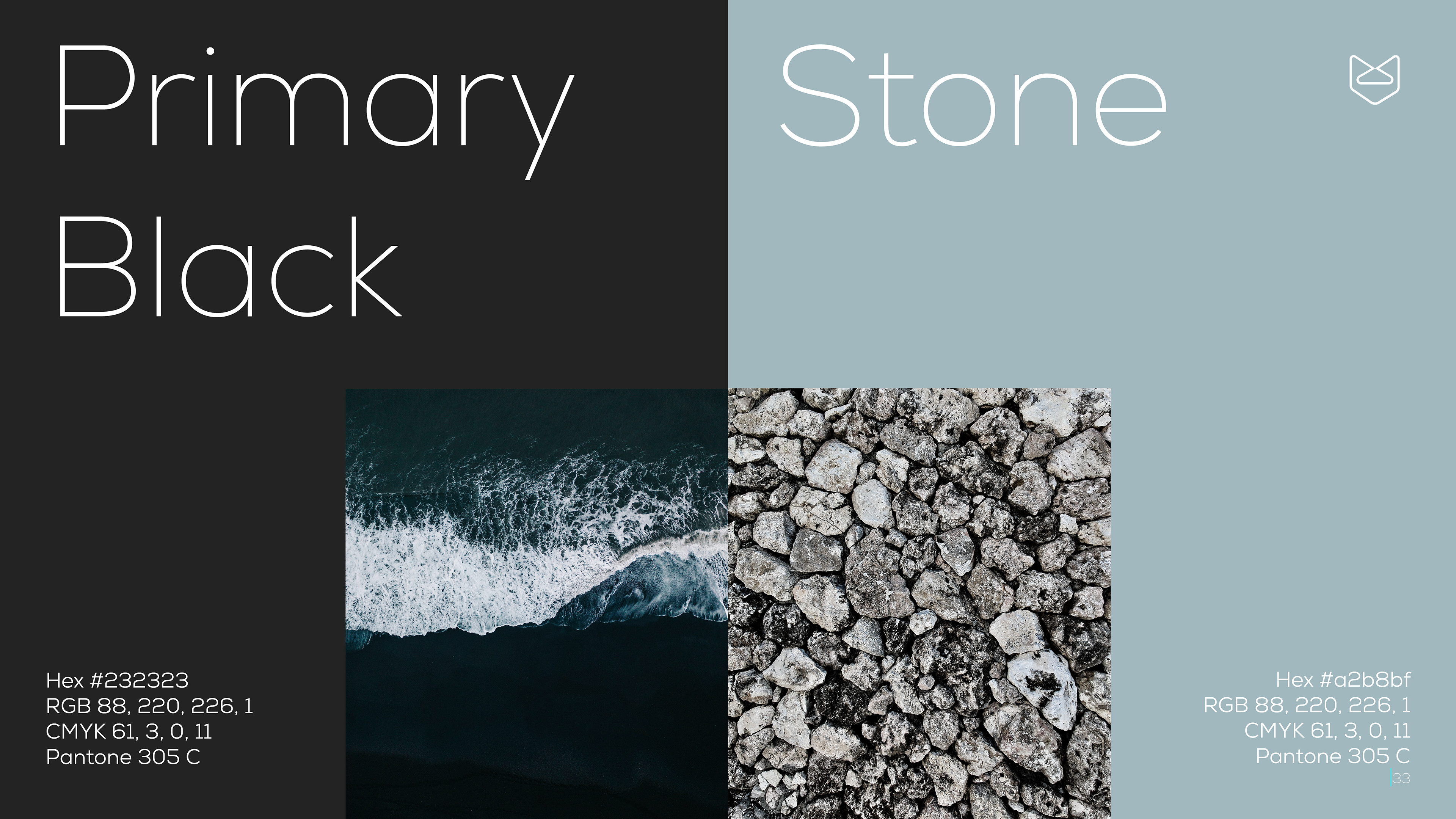
BEACHFOX products currently consist of four sunscreens in four different scents, and each is assigned a bright, popping colour. I conveyed the imagery associated with each scent in full page, editorial spreads, envisioning the 'fun' and 'expressive' image of BEACHFOX. This is extended to the primary colours used for other aspects such as typography, shapes and blocks and website backgrounds, with each colour representing a feature of the beach.
BEACHFOX products currently consist of four sunscreens in four different scents, and each is assigned a bright, popping colour. I conveyed the imagery associated with each scent in full page, editorial spreads, envisioning the 'fun' and 'expressive' image of BEACHFOX. This is extended to the primary colours used for other aspects such as typography, shapes and blocks and website backgrounds, with each colour representing a feature of the beach.
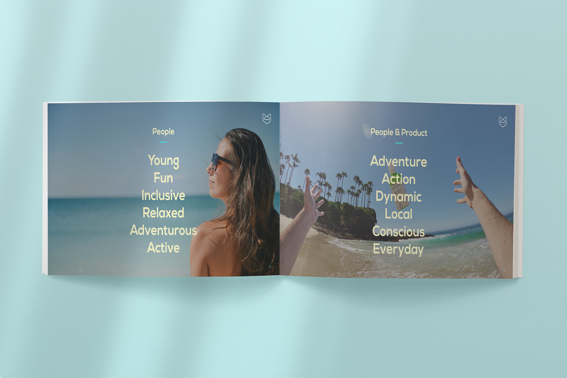
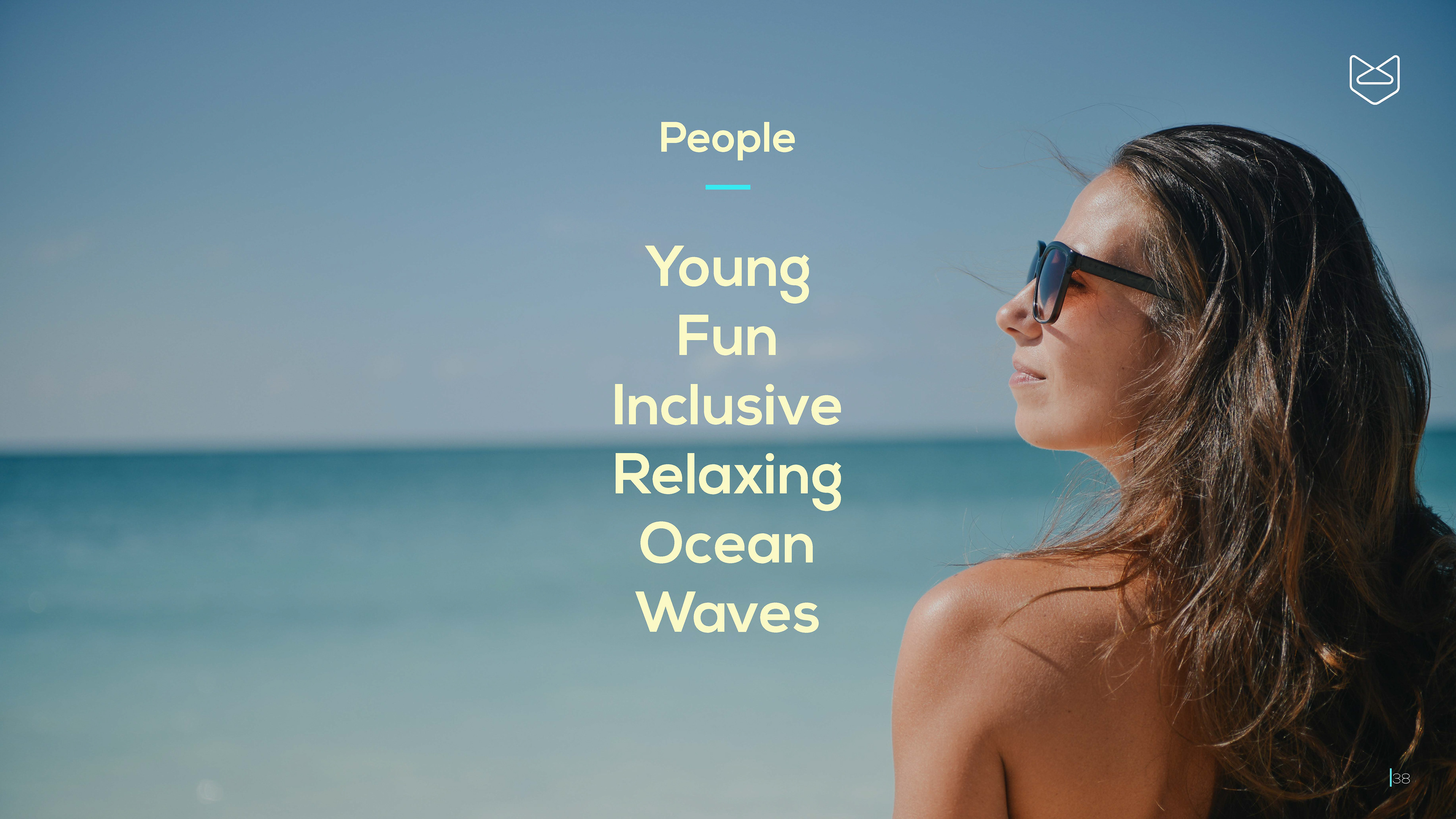
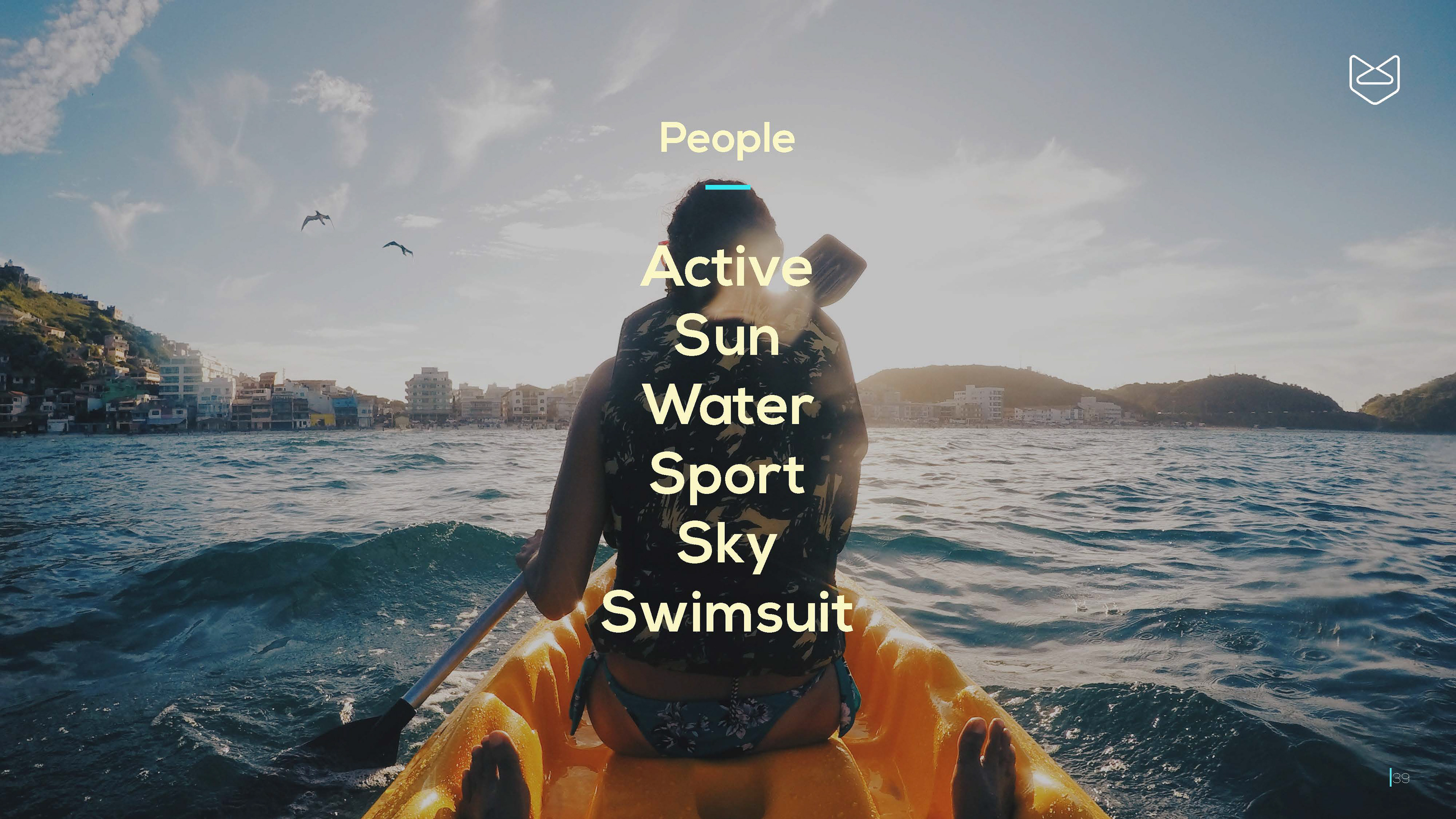
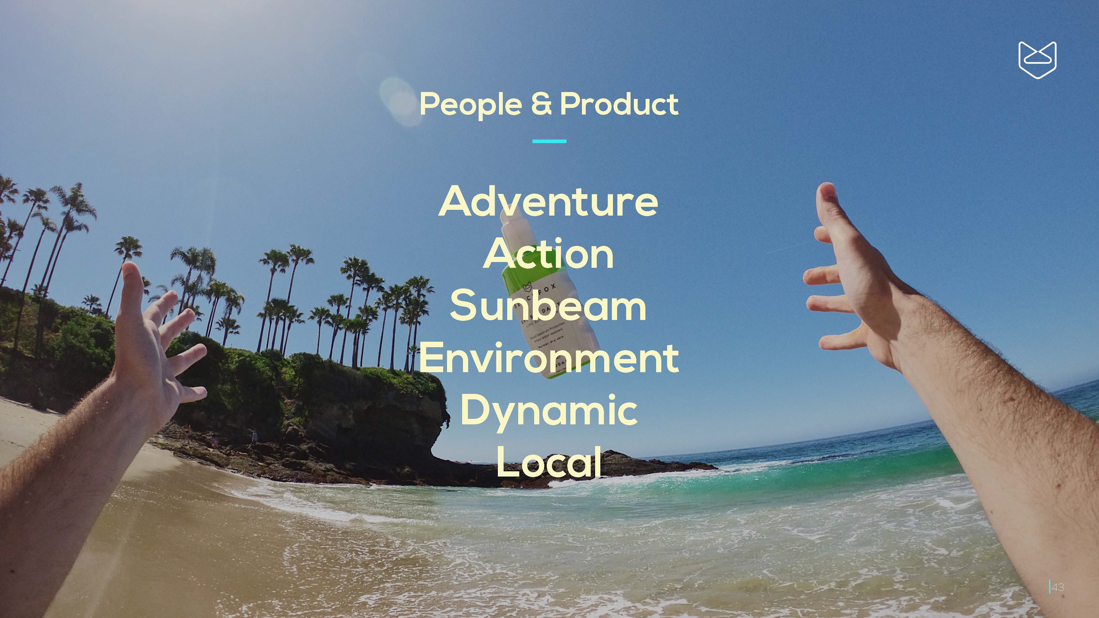
Photography
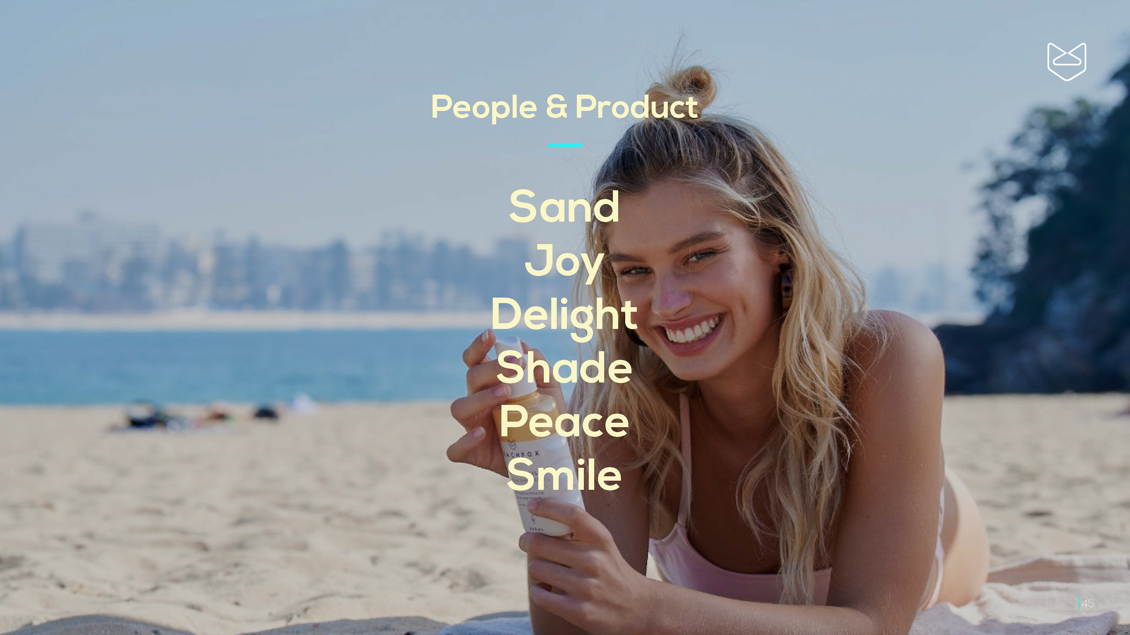
Rather than creating a collage of photographs, I used the consistent full page spread layout and chose several words that captured the essence of BEACHFOX imagery.
Rather than creating a collage of photographs, I used the consistent full page spread layout and chose several words that captured the essence of BEACHFOX imagery.